Ask HN: What are good high information density UIs (screenshots, apps, sites)
127 comments
·May 8, 2025meew0
Any EMR (electronic medical record) would probably fit this description. For example Epic, the leading one in the US: https://www.emrsystems.net/epic-ehr-software/ Or Orbis, the leading one in Europe: (there's not many good screenshots of it online but this PDF has a few) https://www.bfarm.de/SharedDocs/Kundeninfos/DE/09/2023/32261...
There's a myriad of other ones as well, they all have similar UIs, with the primary goals being to never hide any important info from the user, and to let the user take important actions quickly. That naturally leads to high density. Nevertheless it needs to be reasonably intuitive, since doctors and nurses tend to not be very tech-savvy, which leads to some interesting design constraints.
abound
I didn't see anyone mention the McMaster-Carr website [1]. It may not be the "densest" out there, but it's clean, functional, and nicely presents a lot of information at once.
WillAdams
There is (was?) an absolutely fabulous answer on quora.com which detailed how this site came to be --- from memory:
- initial ecommerce site was a mess (basically a page-by-page recreation of the catalog?) which saw minimal usage
- the redesign, which focused on usability --- notably reduced cognitive load --- resulted in an immediate uptick in orders which grew markedly for a long while until it represented the vast majority of their business EDIT: and also optimized for repeat orders on a schedule
If someone could find that, or a better writeup, I'd be grateful (it's _not_ the Medium.com article) and this page: https://iacollaborative.com/work/mcmaster-carr/ is just a mentioning by the company which did the underpinnings, not the overall architect. This link is decent: https://www.bedelstein.com/post/mcmaster-carr
There was of course previous discussion of this here:
https://news.ycombinator.com/item?id=34000502
Video on why the site loads so fast:
https://www.youtube.com/watch?v=-Ln-8QM8KhQ
(which is from the Medium.com article)
squiggy22
I wonder how much additional traffic, links, seo benefit and general brand awareness this site has generated simply off doing things to this standard.
A fly wheel of benefits.
alnwlsn
Actually, I'm pretty sure I've never seen a McMaster link in any search engine. Even if you google a direct McMaster part number, like "91251A449", McMaster will not be among the results. While the url to that product is just https://www.mcmaster.com/91251A449/
alnwlsn
I'm going to go against the crowd and say that I prefer DigiKey and Mouser's sites over McMaster. The filter/apply pattern they use when trying to narrow things down is a lot quicker than waiting for Mcmaster's auto updating window. Usually, when I'm looking for something, it's not for an exact specific item, but to know what options are even there in the first place. Selecting ranges of things in McMaster has always felt a little cumbersome, but Digikey has always had it right.
The other thing McMaster does that's kind of annoying, but also kind of funny, is that they go out of their way to purge the branding of the items they stock. Very understandable why they do that, but sometimes they do it when it doesn't make sense. Want to buy a generic "graphing calculator" for $126 which is definitely not a Texas Instruments TI-83 Plus? Here you go! [1]. Look, you're not fooling anybody here.
aqfamnzc
The calculator is an extreme example, but I've wondered in the past if the reason they scrub everything is so you can't take the manufacturer part number to buy elsewhere. McMaster is undoubtedly more expensive in many cases, but the service they offer is consolidating a million parts into one catalog with CAD drawings, specs, etc. Hiding branding prevents you from taking advantage of that without making a purchase.
kube-system
I kind of like how they genericize everything. It reduces the cognitive load of making decisions, and presents all of the options in the most uniform way, based on their hard specs, and not marketing BS.
fourside
It’s one of the first examples in the link the OP shared. It’s a high quality post!
alwa
Part of its pleasure is the way it reduces an intrinsically dense catalog of parts to such a consistent and sensibly-structured interface.
Even though it’s never failed to connect me with precisely the part I’m seeking, to this day their interface spooks me a little: where are they hiding the endless walls of text and part numbers, the kaleidoscopic wall of bins?!
agumonkey
And there's something utilitarian in its internal and external design. No flashy, no fancy.. 99% informational and low lag.
CleanCoder
The low lag part is especially impressive. Here is Wes Bos taking a deeper dive into the intricacies of technologies used to accomplish this: https://www.youtube.com/watch?v=-Ln-8QM8KhQ
agumonkey
I remember people digging into this because it used good sense over vanilla js instead of complicated stack.
canucker2016
tl;dw - ASP.net, image sprites, yui, jquery, preloading, and caching
rdtsc
Absolutely! Every time I see it mentioned, I end up browsing it just marveling what a nice job they did. It's laid well very well, has just the right information, it's lightning fast, I like the color scheme.
If there is a UI design award somewhere, they should get definitely get it.
quacksilver
RS is similar though was better in the past
example: https://uk.rs-online.com/web/c/?searchTerm=zync+7010
jotux
Similarly good, but small mechanical component specific: https://shop.sdp-si.com/
thih9
Programs used by pro creatives. Some people regularly spend 8h/day using a single such product as their primary work tool.
E.g. pro desktop versions of photo, print, video, sound, etc editing software usually feature good UX and high information density.
One well known example of that is Blender - here is a chapter from their manual about its user interface: https://docs.blender.org/manual/en/latest/interface/window_s...
turnsout
This is the answer! Information density is not inherently a virtue. For many tasks, you want to focus the user's attention, which usually means less density. But professionals often want as much as possible accessible from a single screen, so they don't need to click around too much.
In addition to creative software, look at professional stock/crypto trading platforms, EHRs, POS systems, CRMs, or any software targeted at a vertical—veterinarians, fleet management software, etc. Many of them will run counter to "good UI" best practices. But if you interview their users, you might be surprised by what they love about these interfaces.
chromy
Look for tracing/profiling/binary analysis UIs:
- https://superuser.com/questions/1117466/using-windows-perfor...
- https://github.com/wolfpld/tracy
- https://github.com/WerWolv/ImHex
3D modeling / CAD software:
- Blender/Rhino etc
- Similar for audio you can search for 'DAWs' (https://blog.landr.com/best-daw/)
Many examples on https://x.com/usgraphics/media only some software.
Not on the data side but can be useful just for contrast from todays software:
rollcat
Agree on DAWs. Even though I'm familiar with the general concepts, every time I try out a new one (Logic, Reaper, Ableton), it's quite overwhelming at first. You have a pretty good idea about what's supposed to be there, but the sheer amount of knobs and buttons... But once you get in the flow, you quickly find out it has all the information you need, nothing more nothing less, it becomes second nature.
(Notable omission: GarbageBand. It has the opposite effect, it instantly puts you into action, but becomes more frustrating the more you use it.)
tgv
Logic Pro X really impressed me with its accessible UI. Yes, there are a lot of functions, but they don't get in the way, and the important ones are fairly discoverable. Reaper, OTOH, not so much. Its routing is ... flexible, but unfortunately also in places where it doesn't matter, or even gets in the way.
sunshinekitty
The zachtronics website is completely broken on mobile with constant full-screening images, had to re-open my browser to exit..
wackget
As someone who recently tried to use Blender for an extremely simple task... Blender's UI is absolutely terrible and should not be used as an example of anything except how to design an unintuitive UI.
jwagenet
Professional tools are often made for the efficiency of a professional user and are hard to grok at first glance. Other examples from the parent, like DAWs, suffer from this and Blender is no exception. By all accounts it used to be a lot worse.
null
cluckindan
It is geared towards keyboard use, but I agree, the UI is not structured very well - too much mystery meat!
VectorLock
Sometimes I watch HOWTOs with Blender and it says stuff like "Hit NumPad +" and it makes me think, damn they going to tell me to start using the META key next?
chromy
I think intuitiveness and density are orthogonal properties (although often both desirable).
Regarding Blender specifically:
Do you have a background in 3D modeling?
I am genuinely curious.
I don't come from an digital art background and I bounced off Blenders UI several times but after doing a tutorial or two now I find I can use it for simple things. I have always wondered how much it was 3D modeling in general vs. Blender specifically.
In a similar case I have used both Inkscape and Illustrator as an amateur and, much as I love open source, there is no comparison. Illustrator was significantly easier to use and worked better.
mg
I am developing this project, which replaces product lists with what I call "product charts":
The idea is to sort products not by one parameter (like price or release date) but by two - which creates an x/y chart. The product info is displayed dynamically - by default only the image is show. On hover, more info is displayed in a tooltip. And when you click "details", all data is shown.
This way, 300 products easily fit on the screen.
You need to watch it on a monitor to see the chart interface. On mobile, I just display a normal list.
philistine
Great website, the monitor section does not easily cover the use case of macOS users. We want Retina grade displays (5K at 27-inches, 6K at 32-inches). I don't think you even have Apple's monitors?
mg
Yes, product selection is not perfect yet. I originally set out to display the 300 most relevant products in each category. It is probably better to have a larger set of products in each category.
I will tackle that. Not sure yet how hard / easy it will be. Because more than 300 items on the screen initially might make them too small. And adding more as one uses the filters might be confusing.
philistine
Oh and that drive (https://www.productchart.com/ssd_drives/22778) is marked as 20$ per GB, when it's a 1 TB drive for 50$. Many drives have the same problem.
mg
It is 20 GB per Dollar.
abraxas
I like your project. If I may suggest a feature, DPI option in the side panel would be valuable to me. I won't consider any products that have a screen with less than 220 DPI (e.g. laptops, tablets, monitors etc).
mg
All categories with screens (laptops, tablets, phones, monitors) have the option to switch the axis to "pixels per inch". Hover one of the axis arrows with the mouse to select it.
Does that help?
yeknoda
This is good. The users this caters to are also higher than normal earners. Hate to ask, but what is the monetization plan?
mg
Affiliate commissions and license fees from companies who want to use the interface for their use-cases.
xnx
Probably affiliate commission
CamperBob2
Good idea, but wow, the popup mechanism is obnoxious. It needs to be off to the side in a fixed location that doesn't obscure what you're looking at, or make you chase the 'Hide' button with your mouse.
mg
Hmm... the way I use it is that when I put the mouse on an item, that is the one I am looking at. So it is fine that some others are hidden. And when I want to see all items again, I move the mouse into an empty area (usually right next to the item I just looked at) so the popup goes away.
Also, I usually use the filters first. Say for laptops, I set the screen size to >=12inch and the weight to <=3pounds. So there ain't that many items left on the screen.
Do you use it differently?
ixtli
this is great!
jedberg
We used to have an even denser display, but they sadly got rid of it. It was the original reddit mobile interface (served as a webpage, not an app).
There is a screenshot on this blog post (by one of the guys who worked on it): https://pdx.su/blog/2023-04-06-rip-reddit-compact/
dbl000
It's not just information density but rather intended use design. A lot of engineering/manufacturing parts suppliers tend to have good information dense websites that are really catered to their customers for finding parts.
Take mouser.com, digikey.com, grainger.com rockauto.com or mcmaster.com. They all have a bit of a "landing page" but once you go to search for parts you've got something that was really designed to be an intuitive parts search. Compare that with jameco.com which competes with mouser/digikey but has a more classic webshop search system. It’s a bit more frustrating to use.
Some news sites also do a great job of presenting headlines and highlights well in a small area. I think semafor.com is probably my current favorite, but I'll readily admit that it's not the most information dense.
CAD software also tends to be good at this, but that might be just because the UI has chugged along since the 90's. AutoCAD/Inventor/Solidworks/SolidEdge/KiCAD/Altium/Virtuoso are all great examples where if you've got prior experience with them (or even similar software) you can sit down and quickly get up to speed on a project and see what's been done. I think the distinction is that a lot of software/websites are designed to keep the average user focused on a single aspect and so they are designed to either remove or hide the complexity but for more “professional” level tools you need all that data and information. You can probably blame (for better or for worse) material UI for a lot of this spaced-out thing. In my mind that was the first mobile first UI scheme that really took off and it's basically influenced everything that's come sense then. Computer first software might be your best bet to get some examples. Because a lot of the web is mobile first/mobile forward now you probably aren't going to find a lot of examples on that. I would love to see examples of information dense mobile first sites.
A few other examples I just wanted to brain dump:
- labgopher.com
- tld-list.com
- The Bloomberg Terminal
- Ghidra
- Most plane cockpits, especially modern fighter planes if you ever get to see/sit on one.
- A lot of “professional level creative software” – Reaper, Affinity
- Train control and monitoring systems
codingclaws
I develop a HN/Reddit clone [0] that has high density settings. The home page is fairly high density by default. But if you go into the settings [1], then you can really crank up the home page UI density by setting posts per page to 50 and post spacing to 2. The density is more apparent on desktop since the lines don't wrap.
fauria
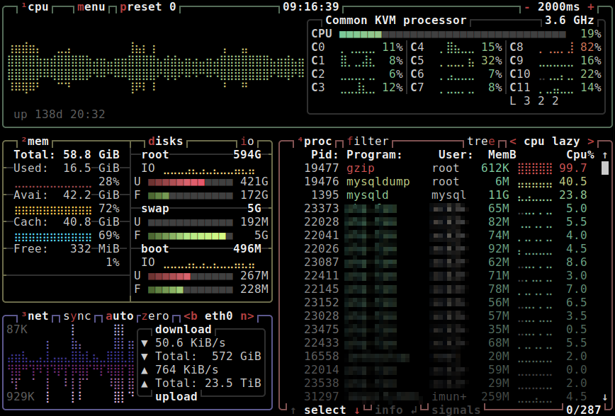
Command line system monitoring tools like htop, atop, btop, etc: https://static.linuxblog.io/wp-content/uploads/2021/11/btop....
mtve
Cisco IOS, highest density information per screen of old days CLI, like "sh int" (show interface) to get almost all required information at one glance.
toomuchtodo
btop is so good for rapid, dense information communication
whalesalad
glances is my favorite as far a density goes
JohnMakin
Dwarf Fortress
SkyeCA
I think e621 would count. (Disclaimer it's a highly NSFW furry booru so I'm not going to provide a link on HN)
It has has one of (if not) the best tagging systems of any website and between the tags and search filters you can find anything you like.
Each page has a header with useful links, a list of tags to the left, and a grid of paginated images with basic stats on the rest of the page. Click an image and you get a bigger version of it with download options, all of the tags that apply to it specifically, and comments from users.
It's basically as good as it can be.
Cthulhu_
Some video games have them, mostly the ones with customizable UIs like Eve Online [0], World of Warcraft and the like.
"Pro" trading websites, for stocks or cryptocurrencies (e.g. Kraken and Coinbase have different interfaces for regular and "pro" users)
[0] https://www.researchgate.net/profile/Panagiotis-Zaharias/pub...
[1] https://mtthwx.com/wp-content/uploads/2018/11/wowow.jpg (silly example)
Just yesterday I tried to find examples of good high information density UIs... and seems to be an impossible task.
Search engines are full to the brim with vague articles repeating each other's talking points, and exception being this blog post by Matthew Ström: https://matthewstrom.com/writing/ui-density/
Image search is no better, with largely irrelevant results.
In the age when everything is spaced out and zoned out gray on gray, what are your go-to examples of UIs that pack a lot of info?