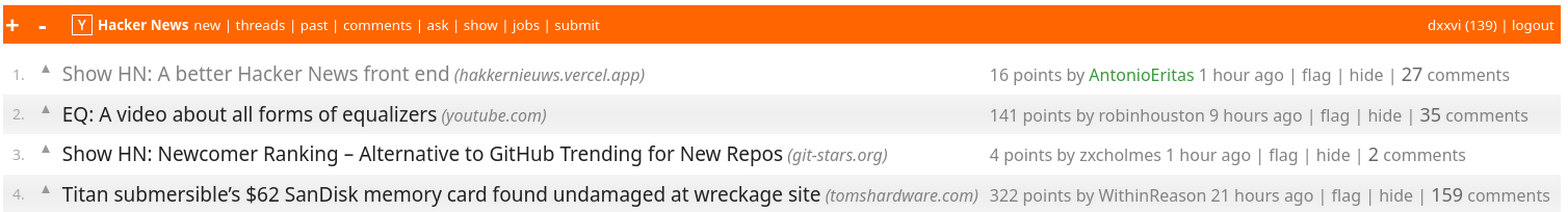
Show HN: A better Hacker News front end
56 comments
·October 19, 2025mosselman
I don’t think this is better. Mind you I opened this on my phone.
Overall there is too little space for the titles and the space there is, is given to the branding of the source, so favicon and domain.
I believe the focus should be the content. The hn community overall is quite good at filtering out the nonsense, so if you go to the homepage there will be quality content and having to filter out based on source is not necessary for me.
The approach taken in your design is similar to a search engine where filtering on source credibility or appropriateness IS necessary.
While it looks “modern” I think your redesign proves that flash does not equal good UX
upmostly
For me, the only lacking feature of vanilla HN is dark mode. I wish they'd add that. Other than that, it's perfect.
jiehong
IMO, Hackernews's value is the comment section.
Some things I wish it had while reading comments:
- keyboard shortcut to go to next/previous comment at same level (`j`/`k` a la vim?)
- keyboard shortcut to upvote a comment while it is selected
- memory of which comments I already read, so that when I come back to a comment section, I can navigate directly to the unread comments (useful for conversations that span multiple hours/days). Perhaps also styling read comments differently.
mvdwoord
I found stylus to work really well for this.. I have most of my apps typically in Nord palette. For some frequently visited websites, such as HN, I apply the Nord theme. Not sure if it was already built by someone else, but something I found chatbots are quite good at is creating custom CSS! I point it at a website and ask for a Nord themed customs CSS. Copy Paste into Stylus... most sites I tried it oneshotted a very decent solution.
unkeen
I really do not understand why they don't.
rcarmo
Me neither. It's a running joke of sorts.
krapp
Given how pedantic and cargo-culty the HN community can be about even the tiniest detail of the layout here, it doesn't surprise me that the mods don't make it a priority. The arguments about implementation details and edge cases would be ceaseless, and people would clutch their pearls about HN "turning into Reddit."
Also dark mode seems way too modern a feature for a forum whose entire aesthetic is frozen in the 1990s. Dark mode doesn't directly improve the signal to noise ratio or quality of conversation.
Maybe the best solution is to just let everyone use whatever plugins or browser scripts they want to and leave HN as it is.
maratc
Could this (in theory) be achieved with a per-user "load css from url" field?
ranger_danger
Dark Reader extension does wonders for me.
rcarmo
I keep pointing this out every time dark mode comes up, so don't take it personally: embedded browsers (like the ones in RSS readers) cannot use extensions, and only native dark mode support in the site itself works there. It is _extremely_ annoying to get a white flash while reading news in the night time, and I really don't get why HN doesn't have a pair of CSS lines that would fix it for everyone.
ranger_danger
The latest version of Qt WebEngine supports both userscripts and extensions.
But embedded browsers could always inject their own userscript for dark mode, so I don't really see the problem.
exitb
Just tried it and it makes the vote buttons disappear (mobile Safari).
ranger_danger
Seems to work fine for me on firefox and chromium:
brazukadev
Compared to lobster.rs there's another useful feature that I miss: unread messages in a thread
mkl
First impression: this is strictly worse. Way too much space between everything (even between lines in paragraphs!) means fewer stories visible on screen, and fewer comments visible. Enormous pointless spaces between comments, grey comment text is harder to read. Site links on stories don't link to site's stories. Data is out of date.
Oarch
I find the favicons needlessly distracting and unhelpful. I suspect we probably use different parts of the brain for processing images and text, so it's a lot of different information at once.
My main gripes with HN UI are the expand/collapse and voting buttons are tiny on mobile. And it's very easy to accidentally hide an article by accident (it's a hassle to undo this).
silvestrov
1) Get rid of all the margins. I'm not here to look at postcards, I'm here to read text. old.reddit is good.
2) Font is too small and light. Make subject font much bigger. The 2nd line is not nearly as important as the title, so title should be much bigger. (your darkmode is better at this than light mode). Personally I prefer Verdana to AppleSystemFont as the latter is very light.
1+2) The posting page has too much vert space between posts and too small font. I'm here for the text.
3) I don't care about icons. They don't help me to decide "do I want to read this posting".
My layout design: https://imgur.com/a/uBPb2pC
bryanph_
I've fat fingered the "hide" button quite often when I was trying to hit the comments button. That's the main thing that I find slightly annoying about the default HN layout
ssl-3
Negative feedback, viewing on a Linux PC with Firefox:
1. It lacks density where HN excels at density. It is my opinion that it has way too much negative space, and that I do not care if my opinion flies in the face of modern web design ethos. (I do not come to HN because my scroll-finger lacks exercise.)
2. It includes tiny little icons that I cannot discern without careful attention. At best, this is distracting and represents additional complexity that provides no positive value.
Positive feedback:
1. The pages do seem to load fast, and that's certainly a welcome consistency.
Other thoughts:
1. If the best it accomplishes is that parts of it stay the same, but other parts get worse, then: It isn't better. It is worse. Change for the sake of change is usually a non-starter, in my opinion.
dxxvi
My hacker news modified with violentmonkey: https://vercel-html-example.vercel.app/hn-violentmonkeys.png
The + - buttons on the top panel change the font size of every thing except the font size of the panel.
Things are arranged to minimize the page scrolling.
The news title and number of comments are darker and a little bit bigger than other elements for an easy reading.
archb
Do you mind sharing the script?
homarp
With normal HN, on the phone I get 12 items from home page. Your version shows me 10.
Overall it has 'more' spacing. Which I don't feel I need: I appreciate the high density of original.
did you add any 'additional' features? stuff lile 'kill file', per commemt bookmark/tag, different search features ( 'more like this', 'best of the day comments based on your liking') would gives some reason to switch
Gualdrapo
Note that the HN hivemind loves crammed, almost unreadable text content, so the feedback you're getting is more than expected.
From my part I see this kind of exercises quite often, but I happen to like this exercise. Actual good content density and the favicons are actually a good idea since they let you know where a link would take you to.
The only downside I saw (for me) is that article titles, in the article pages, are too big.
ubutler
Personally, I like it. However, I like being able to comment and upvote more. At the same time, I'd be reluctant to say the least to hand over my login credentials. It could be quite cool to see this turned into a FOSS RES-style browser extension. Or maybe even a commercial product. I already paid for the HACK app.
hoechst
idk how you would define "no tracking", but this is using vercel insights, a tracking tool.
altought i prefer the default HN interface, i think the ui is generally fine and you did a good job and avoided overengineering.
with a text heavy page like HN, the most important thing is imo to carefully choose a font family and font properties (line-height, letter-spacing, etc.). as is, the default HN does a better job with this but leaves a lot of room for improvement as well.
personally, i'm using a few lines of css to add dark mode to default HN and zoom in to 125% cause the default font-size ist too small for me (an old person).
I forked pajecawav's better-hn repo, which turned out to be an excellent foundation to build on. While the original implementation was clean and functional, it didn't quite capture the essence of Hackernews. More importantly, it was missing some features I considered essential for a truly viable alternative.
After tinkering with it for a while, I think I've nailed it—at least for my own use case. If it works well for me, chances are others might find it useful too. So I figured, why not share it?
Pretty straightforward: no ads, no tracking, no monetization schemes and no intention to do so. Just a simple deployment on Vercel's free tier, which costs me exactly nothing. I'm not expecting millions of users (let's be realistic), but we'll see how it scales if people actually start using it.
Any feedback is welcome, or just use it.