Thunderbird: Fluent Windows 11 Design
130 comments
·July 13, 2025paintbox
BobbyTables2
Indeed. Take a look at late 1990s software, even things with complex toolbars (Word, Corel Draw, etc).
At 640x480 resolution, the toolbar was tiny but powerful.
Now at 1920x1080 resolution the toolbar is relatively huge and dumbed down.
All the benefits of higher resolutions and larger monitors have been lost on stupid UI trends.
diggan
> where we are now (tabs on top, no wasted space)
Tabs at the top is wasted space, I much prefer my tabs on the side instead, as most web content is taller than it is wide, and I have a widescreen monitor. I understand the choice of tabs on top when 640x480 was the most common resolution, but for desktop usage today? Tabs on top seems like an outdated layout choice.
zamadatix
I've always been sad "tabs + browser bar + title bar" (i.e. in a single row) at the top never seems to stick around as an option. On larger monitors this results in a near perfect utilization of space while still being able to have reasonably wide tab titles.
Vivaldi & Floorp offer this through being highly customizable but they tend to have cracks around the edges of their use for the same reason.
I was first introduced to this with a Chrome flag back in 2011 https://www.askvg.com/how-to-enable-new-compact-navigation-f... but they ended up backing out for various reasons (the largest of which was probably the specific design used a pop-down url bar which went over the page area, so could be spoofed).
In 2021 Safari became the largest browser I've seen roll this out as a 1st party feature to general users, but it faced some backlash https://www.zdnet.com/article/how-to-get-more-space-in-safar... I'm not a big fan of their particular styling choices but the layout was pretty decent.
JohnFen
Options are good. I hate having tabs or other controls vertically on the side. I like them at the top. There's no reason we can't both be happy.
naysunjr
Yeah this. What should irk about search bar is cannot be moved. The static nature of UI these days stinks when back in the day we aimed for more composable user facing apps. Mod games by dumping a model file in a dir; boomed recomposed the experience.
Now it’s all micro transactions so an MBA doesn’t have to work anymore.
Now those are power user and dev tools and users get what they decided was the just right info dense or sparse design.
conductr
I generally have the same hatred but oddly on Mac OS I prefer the Dock on the right side. I've been dual Win/Mac user and have had this preference on Mac for a long time. Not sure why as it goes against almost everything else I do LOL
hammyhavoc
I want both via a single button-press, or defaults per-monitor.
What I want on an ultrawide isn't what I want on a portrait 16:9 side monitor.
braiamp
Since nobody mentioned, Firefox and I think Chrome has vertical tabs, Firefox is just released https://www.mozilla.org/en-US/firefox/140.0/releasenotes/
danbruc
There are browser - Vivaldi for example - that allow you to place the tab strip on any edge you want. To me personally it just looks and feels wrong, maybe just because of years of exposure to tabs on the top, but I can not get used to it, even though I have to admit that the tab labels are much nicer to read on the left if you have sufficiently many tabs open.
encom
Not only does Vivaldi allow you to do that, but you can customise every menu in the program. I've modified the context menu to have exactly the things I want, in the order I want them. This is what Firefox should have been.
It's too bad I'll have to dump Vivaldi soon, now that Google is killing adblockers.
eumenides1
Tree Style Tabs! Tree Style Tabs! Tree Style Tabs!
abdullahkhalids
I have Tree Style Tabs on my personal computer, and Sideberry on my work computer. Sideberry is much better and much faster.
perching_aix
This is a popular argument, just one small problem with it: the 4:3 displays of old (640×480 et al) were also "wide" rather than "tall". So by this logic, there would have never been a time where horizontal tabs (or indeed, a horizontal taskbar) would have "made sense".
So I think it's reasonably easy to see that this is not and was never the actual driver behind this decision. It's completely retconned.
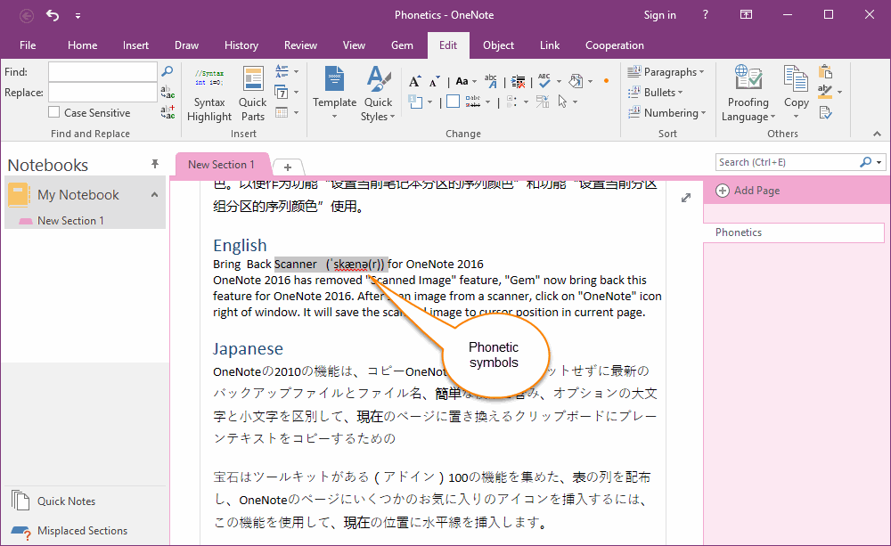
layer8
The driver was that unless you have a large number of tabs, vertical tabs waste more space than horizontal tabs, due to the width of the tabs column for vertical tabs vs. the height of the tabs row for horizontal tabs. Like in this [0] random example with just single tabs, there is a lot more wasted space on the left and right (below “My Notebook” and “Phonetics”) than on the top (to the right of “New Section 1”). If we used a vertical writing system instead of a horizontal one, we’d have had vertical tabs from the start.
Widescreen monitors afford that wasting of space better.
[0] http://www.onenotegem.com/uploads/allimg/191124/12310QH9-3.g...
ragnese
Well, 4:3 is less wide than 16:9 or 16:10 or whatever else we're doing these days.
But, I do agree that this was likely never the driver. In fact, I've always thought the "obvious" explanation is simply that window controls and title bars are at the top, and since tabs are like nested windows inside a window, they would follow basically the same patterns...
ordinarily
Horizontal space is still a premium regardless of monitor size when designing/building for responsive viewports. Vertical space is almost zero cost in terms of design constraints.
Even on large monitors you'd be surprised the number of people at 150% zoom with small windows opened instead of fullscreen.
conductr
Being able to scroll on unfocused applications has been a game changer for non-fullscreen uses. I never zoom though, except HN
stronglikedan
> Tabs at the top is wasted space
Not if your screen is in portrait orientation.
But that wasn't the point of the person you are responding to anyway. The point is all the empty wasted space that was above the tabs before it was removed and the tabs moved to the top.
chartered_stack
The Thunderbird search bar really sucks. Advanced search with the actual functionality is hidden away behind some weird menu while the big honking bar at the top of each page does basic text search and offers nothing more.
laxd
The search bar does filtering in the current folder. Fast, simple, and what I most commonly want.
Calzifer
> I understand that search bar position is not changeable by theming,
It is changeable. With enough dedication you can go a long way just with CSS.
In this case it is even rather easy because the "unified toolbar" the thing containing the search box, the menu bar (if shown) and the tab bar are three elements in the same flex box. They can be reordered by setting the order property.
Only downside in this case is that (if client side decoration is not disabled in the settings) the window buttons (close, minimize) are also part of the unified toolbar and would end (without further fixes) below the tab bar.
As a quick (and dirty) experiment I moved the tab bar left to the search bar in the same row just with:
  #titlebar {
    flex-direction: row;
    > unified-toolbar { order: 2; width: 50vw; }
    #tabs-toolbar { order: 1; width: 50vw; }
  }
Finally Thunderbird's own customization dialog can be used to fill the empty space around the search bar. By default it has a spacer left and right but that is easy to change even without custom CSS.
dazzawazza
I agree with you but it irks me more that the search doesn't find the content I'm looking for. Apple Mail search feels much more useful.
hshdhdhj4444
Quick filters have almost completely replaced search for me.
While that does speak to the strength of TB’s Quick filters it’s also an indictment of its search
runxel
That we can search at all is nearly a miracle given the old and bad infra. At least they work hard (I hope) on replacing the old system with a real database. That should enable the conversation view (Gmail-like), too!
1718627440
How would that look like and how does it differ from the conversation view Thunderbird already has?
eviks
There is plenty wasted space in browser tabs, from close buttons to padding to rounded/non-rect corners
hulitu
> tabs on top, no wasted space) and I think those lessons should be carried over.
hell no. I want the title bar, the scrollbars and the window border back. I work with more than one window.
eviks
How do scroll bars help manage multiple windows?
userbinator
Makes it much easier to see where one window ends.
ttoinou
Do the people who style their app actually use their app on a daily basis for long amount of time ? It seems to me the basic design of app are often the best for eye fatigue, frequent usage, recognizing which information is where fast, contrast, low margin / good usage of space etc. The current design of Thunderbird is not pretty, but it's effective. I used Thunderbird everyday for 10+ years with 100k+ emails in 10+ email boxes, never once did I think about changing the design
stronglikedan
> It seems to me the basic design of app are often the best
Considering the plethora of options, I'd say it's impossible to say what is better until an alternative is tried. And then you can only say that particular alternative is not better than basic, but you still can't say basic is best.
People that style their apps try many alternatives, and often find things that work better than basic for them.
KetoManx64
Yes, I style my LibreWolf/Floorp desktop applications to suit my preferences/workflow and I spend 8+ hours a day using them. I hide elements I don't need, make my sidebar tabs auto collapse/expand when I hover over them, change the scaling factor. While yes, the basic design is good and works for 90% of people that use Firefox, I have over the last decade developed a personal a workflow that works very well for me, and i would argue is much more efficient than the average users. The advantage of open source software is that you can mold them into the shape that suits your preferences.
hammyhavoc
If you ever document it, I'd love to read about your workflow. me@hammyhavoc.com
cosmic_cheese
Generally if I care enough to style/mod an app it’s because I’m using it a lot and its stock UI isn’t doing the trick.
Sometimes it can also drive me to switch to a different app, like with Firefox. FF used to be my secondary browser, but Zen (a Firefox fork) aligns with my needs and preferences better and doesn’t require userChrome mods and addons that are likely to break after some random update some day, so I switched.
Thunderbird would benefit from its own Zen-like fork in my opinion. Its UI has always felt clunky and awkward, and the “new” design just shifts around the awkwardness.
encom
As someone who thinks browser UI peaked in 2008, Zen just feels like Firefox UI designers on ritalin. Had to about:config hack it to show the KDE system titlebar. This software is not for me.
cosmic_cheese
Since a couple of the machines I use regularly have small screens (12-13”), hiding the standard titlebar and collapsing browser UI elements into the titlebar area were among the userChrome mods I had been applying to Firefox, so that particular bit of UI design in Zen is desirable for me.
On desk-bound machines hooked to 27” displays, this isn’t really necessary, but the UI being built around vertical tabs as the standard (as opposed to most browsers, where vertical tabs are a tacked-on afterthought if they’re even supported without addons) is still a relevant selling point.
conductr
> Do the people who style their app actually use their app on a daily basis for long amount of time ?
yes, I'm not wasting my time customizing something unless I use it frequently.
Not a Thunderbird user, but the Outlook default looks similar to the screenshot on the linked page. Initial things that drive me crazy; 1) left pane is a complete waste of screen real estate. I have mine collapsed to just be icons, it's about 1/6th the width as what's shown. It expands if I need it to (on tap/hover). 2) I like my inbox above my message preview not next to it. On the inbox pane, I get From & Subject on line 1 and initial message text on line 2. Same real estate with more content and context. I really like having the message preview line without actually clicking on the message.
Also, by having the message preview pane wider than tall, long paragraphs do not wrap so abruptly and I get more content on the screen. This lessens my need to scroll unless the message has a lot of paragraphs or images. Same for the initial message preview that's visible in the inbox line 2, if it's wider I can see more text. For a lot of emails, I find they are short enough that I can read it all in the inbox without even looking at the message pane. This means I can scroll/scan my inbox quickly without opening each item in the message pane to view it.
Anyways, I wouldn't care if I didn't use Outlook daily. For some people, maybe the defaults work but I feel like I get a lot of productivity out of these minor customizations
bshacklett
I would love to know what software Atlassian uses to maintain documentation, because I have a hard time believing they’re eating their own dog food.
girvo
Confluence, and DAC mostly
hammyhavoc
Something not making my eyeballs bleed is part-and-parcel to me actually wanting to use it. I value function over form, but Thunderbird has never been a looker. Plenty of UX friction too. It's just convoluted and messy.
ape4
Maybe I am the only one who didn't know this. It seems "fluent" doesn't refer to a fluent interface in programming https://en.wikipedia.org/wiki/Fluent_interface but rather its a name of a Microsoft style https://fluent2.microsoft.design
xpressvideoz
Perhaps embarrassingly, I knew the second one, but not the first.
huhtenberg
  So  much  padding

  So  much  wasted  space

  Such  low

    information  density
Night_Thastus
Screens these days are huge and high resolution, and my eyes aren't getting any younger. I'm finding that I like more white space and padding as time goes on.
For normal Thunderbird, I swapped from the more compact options to the most loose/padded options.
creshal
Screens are huge, that's why I want to take advantage of it and fit more windows on them, not less. But with how foamy modern apps are, it can be a struggle to have two windows side by side on a 2560px wide 27" screen and not have content cut off that would've been perfectly visible on an 800px screen 20 years ago.
eviks
For your eyes you'd better have larger text instead of wasting the same space with floating
Night_Thastus
I do both.
userbinator
Much padding, such space. Wow.
(Couldn't resist...)
carlosjobim
There's a lot of padding in the screenshot, but you can also see that any user can reduce it by resizing the sidebar and inbox column.
bluedino
Had you told me back in 1995, that in 30 years we'd have 4K screens and I would only be able to see 10 emails in my inbox at one time...
Netscape 2.02 or Microsoft Mail client from back then looks amazing by comparison.
dotancohen
This isn't Thunderbird. This is a Thunderbird theme.
Normal Thunderbird still gets two to three dozen email subject lines on the screen. I absolutely love it, I've been using it for over 20 years through the rough and through the good. We're in a good period now, and it's been a good period for quite some time.
nullgeo
Not a fork of thunderbird. It's custom CSS that renders the thunderbird "chrome".
dotancohen
Corrected, thanks.
markasoftware
just tried installing it in case last time I tried it >5 years ago was during the "rough".
I was impressed that it correctly inferred the IMAP and SMTP settings for my custom domain name, but after using it for ~30 seconds random old emails started appearing at the top of the email list, above my latest emails.
Maybe I'll try again in another 5 years.
edit: someone thinks i didn't wait for imap to finish. I did. My latest email appeared at the top. Then 30 seconds later some ancient emails popped up above it, seemingly triggered by scrolling in the email list pane.
pjerem
Or just maybe click the arrow to sort by date ?
accoil
I get something like that in the initial IMAP sync. Some of my old emails will surface to the top with the current date as today. Never really bothered looking into as it only happens once, but I've been assuming that the date header on those emails were missing.
ghosty141
Thats just a setting in thunderbird. Indont see the problem with personal preference to show less emails
throwaway915
Change it yourself then. It's right there in the documented CSS file. Not even overobscured SCSS!
And Netscape in 1995 look good in comparison to.. Pine?
citrin_ru
A couple years ago I did run one of early Thunderbird versions in a Windows7 VM and it did look amazing too. TB designers are likely trying to improve UI but most updates are just change how it looks not necessary making it look better or improving UX. Though quick filter is a relatively recent addition if I'm not mistaken and I use it a lot.
null
SebastianKra
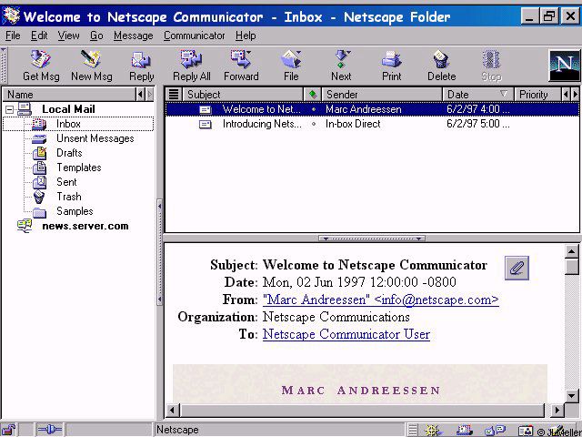
I'm to young for Netscape, but do you mean this [^1] interface, that's truncating the subject and hiding the body?
Also, which use-cases do you have where you need to see 20 emails at once?
[^1]: https://www.pixelbeat.org/docs/netscape_email/ns_4_email.jpg
wpm
That interface is probably 640x480, so of course it’s truncating things.
And I’m sorry, you really can’t fathom why someone who gets a ton of email would want to see more of them in their inbox at the same time?
bluedino
Well, you can have a higher screen resolution than 640x480, resize those columns, hide the ones you don't use...
Look at the Thunderbird 1 and 3 screenshots on that page
graphememes
time to make an email client...
carlosjobim
Let me tell you then that you can see 9 lines of text in the e-mail which is currently opened.
accrual
I agree with others about the search bar, kind of looks like a fallen tree in an otherwise pristine field of aero grass.
I love the translucency look of "Fluent" design though. Windows Terminal has a "Use acrylic material in the tab row" which I like to enable. It feels like a callback to Windows 7's Aero which I miss.
Perhaps together with Microsoft's Fluent/acrylic design and Apple's WIP Liquid Glass UI, and with projects like this Thunderbird theme bringing the design to OSS projects, we can bring back some of the optimism and beauty of those early glass designs.
tummler
Love the theme.
Now if only Thunderbird weren’t a clunky POS. I’ve lost track of how many times I’ve given it another chance after people swear “it’s really better now” again.
Still refuses to follow chosen settings for how much mail data to download/store locally (it always eventually downloads everything).
Dennip
Why oh why can't the search default to "view as list" weeps
nailer
JMAP support has been open for 9 years now: https://bugzilla.mozilla.org/show_bug.cgi?id=1322991
sylens
It's wild to me they won't prioritize this. We have good JMAP providers like Fastmail, we just need client support
RussianCow
Isn't Fastmail basically the only one? What other well known provider supports JMAP?
snozolli
it always eventually downloads everything
I have the opposite problem: I absolutely cannot get it to download everything. What it does do, however, is constantly re-download mail, to the point that it's extremely slow and regularly pops up "folder cannot be compacted because another operation is in progress" errors when I'm just trying to click on folders.
Calzifer
> Also, note that some areas of ThunderBird are rendered outside of the influence of userChrome.css in a "Shadow DOM" - as such, it is not possible to fully theme all elements of Thunderbird.
With some limitations it is possible to restyle Shadow DOM elements. It is just a lot harder to select the right element if it is inside a shadow dom.
I found a workaround (don't remember where I found it) which I use extensively in my personal userChrome.css.
The basic concept (afair) is that you can write selectors which match inside the shadow dom as long as they do not need to "cross" the shadow dom "boundary".
A good starting point for me is often to select by tag and part attribute, e.g. image[part="icon"] { ... }
Now the trick to style a particular instance of a web component (shadow dom instance) is to use variables and defaults.
With a selector which targets the "root element" of the shadow dom I set variables for any value I want to change and with a selector which is fully inside the shadow dom I add styles using the variable (which is then only defined for that particular instance) or a default which effectively cancels my custom style anywhere else.
As concrete example the dialog to create new calendar events has a drop down box to select the calendar where each entry is prefixed with a dot with calendar color. The menulist has a shadow dom and the menupopup another. I styled those dots as squares (for fun and because I think the modern web is to round). So to set the variables on the "outside" I have:
  menulist#item-calendar {
    --parthack-boxmarker-radius: 0;
    --parthack-boxmarker-image-size: 1em;
    --parthack-boxmarker-border: inset 0 0 0 1px color-mix(in srgb, black 20%, transparent);
  }
  menuitem.menuitem-iconic > hbox.menu-iconic-left > image.menu-iconic-icon {
    border-radius: var(--parthack-boxmarker-radius) !important;
    width: var(--parthack-boxmarker-image-size, revert-layer) !important;
    height: var(--parthack-boxmarker-image-size, revert-layer) !important;
    box-shadow: var(--parthack-boxmarker-border, none);
  }
Now this will change only the icons only in the menulist with id 'item-calendar' and leave others unchanged. Whether I use revert-layer as default or something else depends on what style the element has by default and try and error.
Calzifer
Also
> it is also not possible to theme the settings areas.
I don't see a reason why this should not work. If by settings area the author means the settings page which in modern Thunderbird is more or less a web page in the content area, it should be stylable with userContent.css instead of userChrome.css.
The hard part is to find the right @-moz-document selectors for each individual content page.
notpushkin
Would it be possible to make a PostCSS plugin for this?
Calzifer
Don't know what exactly PostCSS is but with a JavaScript addon it would probably be wiser to inject the custom css directly into the shadow dom instance if possible and avoiding such hacks.
Also, by the way, when JavaScript addons get involved: userChrome.css is applied quite unfortunate in the css cascade. It gets low priority that is why they are usually full of !important rules. With JavaScript it is possible to add custom css instead as so called author stylesheet which makes it easier to override default styles. (never tried it myself)
https://old.reddit.com/r/FirefoxCSS/comments/msoqte/how_can_...
AdmiralAsshat
I'm still using the Monterail theme for Thunderbird [0], which sadly seems to have never really progressed beyond the proof-of-concept stage and hasn't been updated in eight years.
thesuitonym
It's a good looking theme, and definitely fits the design, but I'll never understand why people want to make Thunderbird look like Outlook.
detectd
I'd say to make it aesthetically consistent with other apps on the platform, but (especially) Windows is a hodgepodge.
frostyel
[dead]
hk1337
1. Didn't realize Thunderbird was still available
2. Windows 11 design on macOS would be trippy.
t0bia_s
1. There is no better open-source alternative for Windows for mail/calendar/contacts client.
wongarsu
because barely anybody is making desktop mail/calendar/contacts clients anymore. There is very little development in that market as most people have moved to web interfaces
mschuster91
And even Outlook is a web app these days, with "performance" to match.
nosioptar
Claws is available for windows. For my tastes,I'd call it "better" than Thunderbird.
yuters
There really isn't even if you don't need all the bells and whistles. I want my email client to be as simple and minimal as possible and Thunderbird seemed like the last candidate for this. Surprisingly it's the only one I could theme and strip down enough to meet my need.
hk1337
Plain and simple is why I like macMail but it's a bit too simple and really mostly useful if you use iCloud email primarily.
macMail is _okay_ with fastmail
RockstarSprain
I am using Mailspring (0) and it’s pretty good.
nopcode
betterbird has "better" in the name
guluarte
Looks cool, but the last thing I want to do is have my Thunderbird look like Outlook.
I understand that search bar position is not changeable by theming, it's a Thunderbird team's decision, but it irks me to see it take up so much premium space. It was the same with browsers, it took many years and iterations to get where we are now (tabs on top, no wasted space) and I think those lessons should be carried over.