The hamburger-menu icon today: Is it recognizable?
59 comments
·June 17, 2025strict9
Around 10 years ago I thought they were a terrible practice. A win for graphic designers that wanted simple and nice looking at the expense of usability.
But over time people learn and its standard. And as the NN group article points out: it has become familiar and known today.
My favorite iteration of this was in the This American Life mobile app that used a graphic of an actual hamburger instead of 3 stacked gray lines. This was also about 10 years ago I believe. Unfortunately I can't find any reference or graphic depicting it.
nancyminusone
It's been 10 years and my parents are still clueless
"What is that? Why don't they put 'menu' there?"
I don't know dad, I'm not the one who made it
josefrichter
People get used to everything. Including war. Just because they learn how to pull through, does not mean it's any good.
savanaly
But the designs literally go from bad to good once people know how to use them. Unlike war, which is bad whether people are used to it or not. If you're insisting the hamburger design is bad for some other reason rather than people not knowing how to use it, it's the same mistake the designers made in the first place when they insisted it was good despite people not knowing how to use it.
SAI_Peregrinus
Text requires effort to translate, and might not fit well for some languages and some UIs. So managers don't want to pay for translations & thus want only icons, and designers don't want to make UIs that work for wildly different label widths. This is not unique to hamburger menus, but it does mean that "just replace it with the word 'Menu'" will be rejected.
Hamburger menus are annoying because they add a click. They can save some screen space on small devices by allowing most of the top area which would be covered by a menu bar to be clear, with only a single button in the corner. This is pretty useless on larger displays (laptops, desktops, etc.) but makes sense on phones, and sometimes on smaller tablets.
Hiding options happens even with traditional menus. Do you change application settings under Edit->Preferences, or is it File->Settings, or Tools->Options, or something else? Or worse, do you change some things in Edit->Preferences, others in Tools->Options, and yet more in File->Settings?
Hamburger menus aren't always bad design, but they often allow hiding bad design by making the UX worse. Attempting to unify UI across wildly different interface types (desktops, laptops, tablets, & phones) inevitably leads to bad design & bad UX. Keeping a common color scheme or overall style is fine, but the interaction patterns of the different input schemes (keyboard & mouse, keyboard & touchpad, touchscreen) are different enough that UIs need to vary between device types for a good UX.
sceptic123
Why not just recreate the [original experiment](https://www.nngroup.com/articles/hamburger-menus/) rather than citing a book that uses different methodology?
Given the original study shows quite comprehensively how bad a design pattern it is, it would be far more interesting to see that research repeated rather than a test on hamburger variations.
bandoti
The hamburger menu is a pet peeve of mine! It takes much less cognitive load to simply read the word “menu”.
Also, it used to be important when screens were nowhere near as wide but now there’s no longer any reason to use it the way it is.
Perhaps it is permissible on a busy UI with many buttons, but that job was taken by the ellipses, which also takes less cognitive burden!
throwaway843
I'm curious what's cognitively loading about three horizontal bars arranged in a square located in the corner of an app or website.
Screens, somewhat counterintuitively, used to be wider. Because they were not on handheld mobile devices. Then we had the menubar and nested dropdowns, suckerfish, etc. It was an exciting time to see a menu, you were never quite sure what you were going to get - I believe there are positives to learning curves for power users.
But I digress. 三 means 3 in Chinese. It doesn't take cognitive load. Why does a hamburger? I really am curious.
6510
I use to know a gamer who used a phone for something like a decade. He got stuck doing something and I had to point out the burger to him. The thing he was looking for was interestingly enough not there. Apparently all websites he used were perfectly usable without knowing the button exists.
In contrast, some people can't not-read something and it being a button is automatically parsed out. Symbols and icons have to be learned which is a more gradual process. The other day I didn't recognize the flower icon for settings.
bandoti
Well, to put it in perspective, consider these three words:
Menu Settings Notepad
If these are actionable buttons, the message is encoded and decoded by viewers.
Three bars means what, exactly? There’s the cognitive load.
xnx
> Three bars means what, exactly? There’s the cognitive load.
This was true early on when it was not a common convention, or only used in mobile apps. Now, it is nearly universal, though still not nearly standard enough in placement or presentation.
If we were to redo history, it would've been great to see an expanding menu closely positioned by a top-left logo. Sort of like a Windows Start Menu for each website.
throwaway843
Three bars means... the exact same thing the thousands and thousands of times it's been seen before.
People have no inate understanding of 'menu'. We don't even read short words like that letter by letter, it's read as a block and is far more complex than three bars.
inanutshellus
I think it's time to let this pet peeve go. :(
It wouldn't be fair to use "MENU", as not everyone speaks English, and regardless, many UIs aesthetically need an icon, so why not have standardized on one?
It's healthy to have decided on an icon, but I agree an ellipsis would've been (and still would be) intuitive too. Maybe designers trying to make their mark will start using ellipses in new designs... who knows.
etblg
Judging from the list of languages that have "menu" as a word (with a comparable definition to "menu"), I don't think it's a stretch for people to know what the word "menu" means: https://en.wiktionary.org/wiki/menu , it's not even originally an English word afterall.
sceptic123
You're assuming that it's an agreed and understood standard, which it really isn't. Tech savvy audiences often don't find it easy to understand that there are lots of people who don't understand things like this.
In terms of using MENU, if your audience is not English speaking then you can, and should, consider adding internationalisation and localisation as an alternative. If you have considered it for your content, it makes sense to consider it for your UI as well.
JohnFen
Replacing the hamburger icon with the word "Menu" wouldn't make anything better. The problem isn't the icon, it's the disorganization.
inanutshellus
If the designer wants to encourage super-users and quicker access then splaying out all options is better. If they want "clean and tidy", the icon is better.
Heck, even when I have splayed out all the most-important options across the screen... where do I put the /rest/ of the menu options? in an "other" menu, likely drawn with 3 horizontal lines.
JohnFen
I couldn't agree more. The hamburger menu is in my list of the worst UI elements around. It has nothing good to recommend it.
It's barely tolerable in situations where screen space is at a premium, but it's still pretty awful.
> Its growing ubiquity helped standardize its meaning: Through repeated exposure, users learned to recognize and interpret the icon with increasing confidence.
Sure: it's the symbol of the "junk drawer" of the UI. Who knows what random assortment lurks in there? It's a place you go only as a last resort.
v5v3
"Also, it used to be important when screens were nowhere near as wide but now there’s no longer any reason to use it the way it is."
Mobile users?
aidenn0
There is more than enough room for 4 menus across the top of a typical mobile device. If you expect the user to need to access it regularly, you could even put it across the bottom. This is why the homescreen on most phones has 4 items across the bottom; not a single hamburger menu with "Phone, Messages, Web, ..."
msgodel
Even the palm pilot with its ridiculously tiny screen and bad touch ditigizer managed CUA-style menus.
Mobile UI design isn't about making things more understandable, it's about getting the user into a helpless and suggestible state so your ad impressions are worth more.
cosmic_cheese
More than anything hamburger menu type design feels to me like an “avoid effort and skill as much as possible” sort of thing more than it does an “optimize ad revenue” sort of thing, as does flat design. It’s about lowering the bar for what’s acceptable to ship as far as you can possibly get away with. Plaster some scrolling flat rounded rectangles and a hamburger menu on the screen and boom you’ve got an app.
Y_Y
Don't make me think? Don't let me think!
xnx
I had to look up "CUA".
Common User Access (CUA) is a standard for user interfaces developed by IBM to provide consistency across operating systems and computer programs.
bilekas
I'm curious, not a UI designer at all here, but what's so taxing about the hamburger? I grew up with it mostly always around and never even thought twice about it..
JohnFen
My problem with it mostly that it hides functionality. Seeing a hamburger menu gives you no insight as to what options exist under it.
The menu itself also tends to be a "grab bag" of multiple otherwise unconnected things, increasing the effort required to figure out how to do something.
cosmic_cheese
I like to refer to them as junk drawers due to their messy nature.
Apps with hamburger menus also tend to have navigation that’s otherwise not well though out, think burying options in chains of modals where the paths to those options change whenever the app’s dev decides it wants to push a different feature/metric.
KaiMagnus
I know it's only anecdotal, but my mom doesn't get it. She's not super interested in her iPad and basically only uses it when she has to or for FaceTime. She'd be the perfect test subject for stress testing UIs and more interfaces than you'd think are doing a pretty poor job of explaining themselves. Not many icons are intuitive, hiding something in modal windows, muscle memory/dexterity and precision are all problem areas.
The hamburger is basically all of that rolled into one button. It's pretty abstract, you never know what's behind it and when they get fancy with animations and swipe gestures, it's almost always a failure.
I know it's a convenient way to clean up a screen, but the content in that menu needs to be absolutely optional for it to work.
IAmBroom
The implication of "load" is not that it's a huge hurdle, but just that it takes longer (even a tiny bit) for most users to visually assess what it means. Add up all those little delays, and you have a frustrated new user.
I regularly use a piece of software from IBM that has (this won't surprise you) an awful UI. There are not one but TWO hamburger menus, hidden amongst a bunch of text menu headings, and figuring out where the one you want is can be noticeably taxing. Explaining to another user where to click is even worse - "No, not that one, the one under the... to the right..."
Izkata
> but just that it takes longer (even a tiny bit) for most users to visually assess what it means
Also as an example, three horizontal lines also sometimes get used as grips to indicate an element can be click-dragged around. It is less common than it used to be, though.
bandoti
Any symbolic visual takes time for our brains to decode. When compared to language which we’ve spent our entire lives decoding and which comes much naturally, the cognitive burden is much higher.
In addition the three bars are as mundane of a composition as you can get, so it doesn’t capture the eye well to begin with. Typically the eye gets pulled to more visually complexity.
But ultimately it boils down to the decoding idea—language is the ultimate “codec” of human communication.
baseballdork
Isn't text a "symbolic visual"? I would think that at some point a symbol that's used as frequently as the hamburger icon would/could eventually become equivalent to the word.
SirFatty
I assumed that hamburger description was after-the-fact, not the original designation. It always felt that way to me.
JohnFen
I think the graphic itself was intended to represent a menu: a list of items.
Izkata
It was, it's a simplified version of the original that included the border around the lines, similar to one of the examples in the article (imagine a physical restaurant menu). Along the same lines, the three lines have since been further simplified into three dots in a lot of places - no longer looking hamburger-like.
v5v3
The article says 'positon the Hamburger in the top left corner', but many sites have it in top right too.
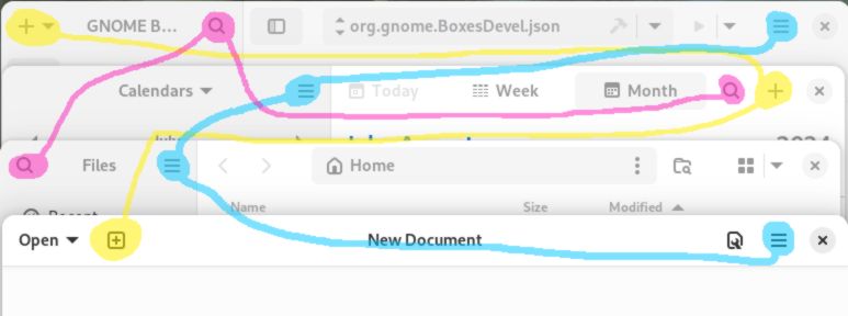
aidenn0
My I present GNOME:
https://woltman.com/media/posts/244/gr-menus-moving-around-3...
Because having a full menu bar at the top made it too easy to find options.
deepvibrations
Yeah, I assumed the standard was actually top-right...
I'd be interested in people's thoughts about which side is best, or if it just doesn't matter.
JohnFen
I don't think it matters which side. What matters more is that everyone does it the same. Most times, I see it on the right.
IAmBroom
I think of its default as "top left". But "top right" is frequent.
"Not quite top, mostly right" is where IBM puts their SECOND hamburger icon on DNG software. May they rot in eternity...
inanutshellus
Most of us Westerners read left-to-right, while being right-handed.
Thus:
"Where should I go?" is answered quickly in the top-left.
Whilst experts repeatedly accessing on Mobile requires top-right.
Just depends on your priorities.
aidenn0
> Whilst experts repeatedly accessing on Mobile requires top-right.
Surely bottom-right?
martin_a
The article is wrong on that. Top left is "reserved" for the logo, top right for a menu. That's learned behaviour all across the "left to right" world.
vjvjvjvjghv
A good compromise would be to place it in the middle. That way everybody is equally unhappy
samwhiteUK
That Newsweek one would have had me stumped for a little, I think. I like to think I'm pretty tech-savvy, but not knowing Newsweek, that looks a little bit like a logo to me. I think I would assume that was going to take me to the homepage and avoid it.
josefrichter
I always said Hamburger is an excuse for a lazy designer :-) Take it with a pinch of salt.
ryanmcbride
I always use em because I'm the laziest type of designer: a dev
pharrington
Hamburger is pretty bad, but we adjust if the pattern is repeated enough.
Which means we can also adjust to a waaaay better alternative to the hamburger menu (but i dont know what that is rn).
IAmBroom
The article points out the solution: the word "MENU".
Milner08
Great if you are an English speaker. Do we then translate that to every language we need to support? Do we scale the UI to work for the different length words?
I dont think that is any better at all. If anything I think its solidly worse.
josefx
Menu seems to be the kind of word that pops up in a lot of languages.
pharrington
Absolutely just use the word "MENU" instead, if the button's already in a textual interface. And if not, labeling the hamburger is almost always better than leaving it naked. But I think there are better overall solutions to be found outside of the local maximum, if you will.
xnx
Great work by NN/group documenting examples in the wild and providing clear suggestions.
It's amazing just how bad UI/UX professionals are (often due to backgrounds in graphic design instead of human computer interaction). Making changes as small as putting an outline around the hamburger menu (makes it looks like a document) or putting dots in front of the lines (makes it look like a button to add bullets) makes the icon unrecognizable/confusing.
null
The hamburger menu would be fine, even great, if it was a standard menu that every mobile app had in the same place with the same look [0]. But its purpose, positioning, and look is different in every app, so it’s just one more thing to click on to see what it does. It also doesn’t make sense as soon as you have more than one menu [1], or on the desktop — mostly because a single menu rarely makes sense on the desktop, and because an icon tends to be a much smaller pointer target compared to a regular labeled menu, for such a main entry point.
[0] like in Windows 1.0, I guess: https://upload.wikimedia.org/wikipedia/en/4/4e/Windows1.0.pn...
[1] unless it’s a secondary but universal menu like the Windows system menu in [0]