Tips for mathematical handwriting (2007)
163 comments
·February 8, 2025layer8
caturopath
I make my x's with a backwards c and a c, like Computer Mondern and lots of fonts https://i.ibb.co/8LPsJKsj/image.png - doesn't look much like a chi or a times sign
No one in the target audience is using × for scalar multiplication.
TRiG_Ireland
My x looks like a cross in normal handwriting, but like two back-to-back c's in algebra. I developed this habit very young, and have kept it.
brianstrimp
Not for scalar, but certainly for vector multiplication which a large part of the audience certainly needs a lot.
FungalRaincloud
I think it's important to consider audience. If I'm working with the intent that what I write is legible to folks who only have a basic understanding of math, I'll usually use the multiplication symbol (NOT the letter x, but ×, intentionally in the middle). Someone with more advanced knowledge of math, who may be more inclined to think it's an x, because my handwriting is shit, I will typically use the dot operator. But then there's the whole other audience where I need to define what the dot operator does. At that point, I'm probably pulling up something like LaTeX, because, again, my handwriting sucks.
Funnily enough, when I write for the purpose of math, my numbers are more legible than when I just write down a number. For some reason, I code switch in my handwriting. Kinda obnoxious when I'm filling out forms.
layer8
Audience is important. I'm not American and didn't learn the cross symbol for multiplication in school. We used the middle dot.
js8
In the handwriting I learned, x had hooks on all four ends, while greek chi only on two.
Anyway, I usually use simple cross as x, because it's only very rarely confused with cross product (and you can always parenthesize).
patrick451
Depending on the context, dot and times may have different meanings.
lupire
The article alludes to this when it mentions Calculus 3 (vector calculus):
× is the cross product.
• is the dot product.
In dimensions higher than 1, they are different.
fifilura
In Sweden, with scalars, we used vertically centered dot, but even that is pretty uncommon since most of the time, two letters or a letter and a number are mixed and then it is left it out altogether.
This made the x problem much smaller.
rossant
In France we use the wedge ∧ for vector cross product.
SAI_Peregrinus
Then what do you use for the outer product?
f1shy
Same in Spanish. That gets rid of the problem.
RossBencina
I find it clearer to write dot products using inner product notation 〈,〉rather than \cdot .
nxobject
I think the two example images are actually the same. (I've always done an italic X.)
TheRealPomax
I can't remember the last time I actually wrote a times sign.
floodle
I did often in my degree, not for multiplication but the cross product
TheRealPomax
sure, but in that context there's no ambiguity (and technically, it's not the "times" symbol, that's the cross product symbol). We don't really use "x" in vector maths, it's all "a", "b", "v1", "v2", etc =)
(at best you might use a .x subscript for 3D graphics but when did anyone ever do that by hand)
waynesonfire
i center the x times sign.
buescher
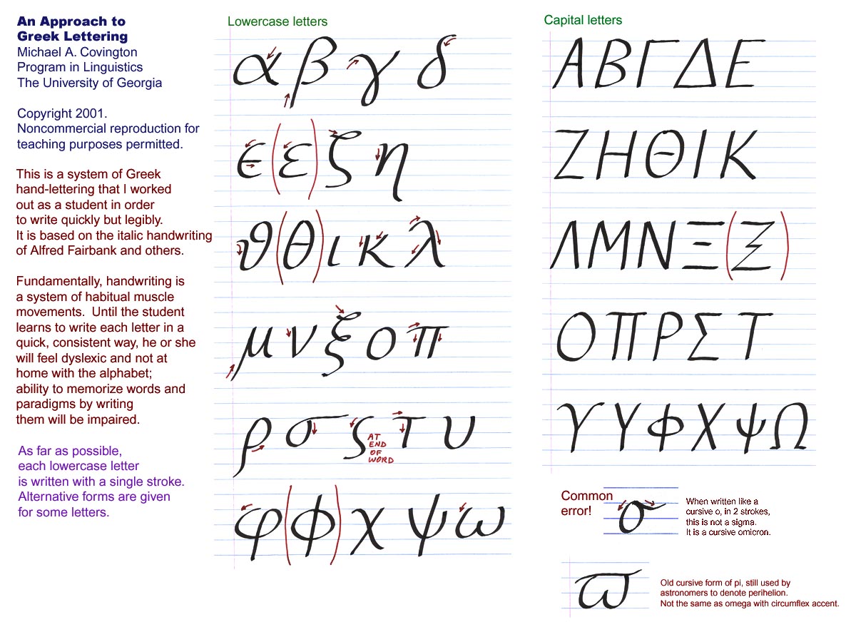
For Greek I like this: https://www.covingtoninnovations.com/pens/GreekChartLarge.jp...
There’s an old joke about “mathematical maturity” meaning being able to write a lowercase zeta, but I took enough classes from professors that would confuse xi and zeta that it probably doesn’t matter that much.
bradrn
Meanwhile I always liked this one, even though it’s not specifically focussed on mathematics: https://foundalis.com/lan/hw/grkhandw.htm
bluenose69
This is a good resource, and pretty much what I tell students in my classes. I take great care to explain how to write symbols, and I also give multiple pronunciations of the Greek letters.
Students with math and physics backgrounds are fine with Greek letters and other mathematical symbols, but the biologists in the class are mystified. They also get terribly confused when I reuse symbols for different purposes.
What I've discovered is that the students who have trouble with mathematical notation and reasoning got derailed when a teacher, in an early grade, said "let x be the unknown". That is a phrase that never comes up in other contexts, and I think it throws them off track. Many find it difficult to get back on-track later, so they memorize and sleep-walk their way through other mathematics classes until the system no longer insists that they take them. A shame, really.
RossBencina
> got derailed when a teacher, in an early grade, said "let x be the unknown"
I don't have the experience to know myself, but I imagine that there are various triggers of early mathematical derailment. It would be interesting to see a list of common causes.
Personally I find it hard to internalise canonical notation. Like f and F in probability theory, which is which again?
jampekka
> Personally I find it hard to internalise canonical notation. Like f and F in probability theory, which is which again?
Probability theory's notation isn't very canonized. The typical usage, f for PDF and F for CDF, is easy to remember from the calculus notation of uppercase being an integral of the lowercase.
brianstrimp
> I imagine that there are various triggers of early mathematical derailment
I have come to believe that the main trigger by far is the attitude of society. Of parents, family, friends, tv stars, heck even many (non math) teachers. "I wasn't good at math haha" is such a standard phrase to hear, and parents telling their kids that they don't need to worry if they "don't get it" as if it's some mystical topic that only a few gifted can unlock. Plus the uncool stigma attached to "math nerds", folks who simply have an open mind to try to "get it", turns out that it isn't actually that hard. At least when talking high school math or some basic college classes.
manvillej
I found this little pocket mathematics notation book when I first studying undergrad in this used book store in Boston. it literally carried me through Calc, Linalg, stats, dynamic programming, stochastic processes, game theory, economics, etc.
I ended up copying it by hand along with every exam and test notes over my entire degree into one little moleskine notebook. its a god send any time I have to remember how to do something or learn something new.
temp3208
Sounds great! Do you have the title/author? Thanks very much.
Kwpolska
> Make a point come out of the top of the p, to distinguish it from a rho.
Or make it \varrho (ϱ).
> Keep the slash in the phi vertical; keep the slash in the empty-set symbol slanted.
Again, \varphi (U+1D711 which HN doesn’t seem to like) is easier to distinguish.
The author silently chose \varepsilon in their TeX, but chose to ignore the rest of the variants.
My grammar school math teacher used a very large ascender for the alpha, almost into serif-£-sign-without-the-line-through territory.
mkl
There are two other phis with the (non-mathematical) Greek letters earlier, but unfortunately fonts vary in which one they display as \phi or \varphi: φ (U+03CD), ϕ (U+03DC).
fifilura
My tip is to use white paper. No lines no squares, just white.
In Sweden you were expected to use paper with squares but it adds a lot of clutter.
pizza
I was once taking a real analysis class and there was a very gifted student in my class. She pulled out her notebook one day at a study session and I noticed it was kind of unusual - the pages were very large, and made of a somewhat thicker material, with a slightly rougher texture. Ink also seems to set onto its surface slightly nicer, and it doesn't really bleed through onto the other side either.
She explained to me that it was actually a kind of notebook specifically for artists, and that she much preferred it to the normal plain paper notebooks you typically get.
I bought one myself, and I had to agree with her - it was a much 'nicer' experience to write on it - diagrams could be way less cramped, branch out without hitting the edges. The tactile feedback due to the thickness of the paper was also nice - in a way, it felt like the "mechanical keyboard" of paper notebooks.
Never switched back again after that, and many people I work with have found it curious and nice to work with too.
Part of me feels that there may be more than just a gimmick to this. In the way that it's been shown that pen and paper help for understanding versus typing, I wonder if "the niceness of the pen and paper experience" would have an additional tangible positive effect, too
ykonstant
This is famously how Maryam Mirzakhani worked as well. Huge thick A2 sheets where she doodled and did computations; she said she disliked the cramped style of normal notebooks.
fujinghg
I used plain for a few years but it has some problems. I now use faint lined paper. Usually Muji notebooks. I leave a blank line between each statement. The lines are handy if you want to make something readable and well aligned which is fairly important. Scans fine.
My kids were forced to use heavily marked blue squared paper. They had problems writing and reading. I pointed this out to their mathematics teacher and said that it may be detrimental and got a diatribe of “what do you know”. Such a bad attitude. I had an answer to this which was embarrassing to him.
RandomBacon
Engineering Paper FTW (for the win):
https://www.amazon.com/Tops-Engineering-Computation-Punched-...
I assume most middle school teachers specify how papers should be organized in binders and labeled with names, dates, etc; but below was my method I developed halfway through college:
Top Margin use: left - name, center - class, right - date
One binder per semester; a divider for each class; handouts, tests, etc were hole-punched and placed with my notes in chronological order.
If my notes didn't make sense as I was copying down what the professor did, I would rewrite my notes later that day while figuring the problem-solving process out and making the notes/arithmetic easier to follow.
This method also applied to non-math-related classes.
ramenbytes
I love engineering paper too! My weapon of choice is this pad: https://www.rspaperproducts.com/products/95182/ I have not tried the Tops yet, I think because I saw somewhere it was thinner? I like the slightly thicker paper the buff pads come with, and it plays nice with my fountain pens.
fujinghg
Worth nothing you don't need squared for mathematics. Not even slightly. Most of the stuff is written in English with a few lines of other stuff between.
Unearned5161
I've gone through so many phases on this. But lately, the more writing intensive my math classes get, I've settled on lined paper.
Blank paper is too... Blank! And I'm more prone to write big and messy and waste pages (even though it's all digital)...
annzabelle
Agreed. I did a pure math degree where most of my classes involved copying down 2-3 pages of axioms/proof per lecture, and I settled on mead letter size college ruled spiral notebooks, and yellow note pads for scratch work. Wide ruled led to too much wasted space, graph paper was visually busy and led to awkwardly spaced letters, dot paper just didn't really work. Smaller paper sizes didn't end up holding enough information per page, spiral binding was best for being able to rip out and toss pages, the perforation was nice for the occasional hand in sheet, and I had no need for a nicer quality paper.
Also I always kept Pentel Twist Erase III mechanical pencils with 0.5 mm lead, Hagoromo chalk, and a 4 color set of chunky expo markers in my bag.
lynguist
I switched to plain white when I was ca 20 years old and never looked back. I need to use plain white since then and I am so used to it that I find lines or grids slightly offensive to me and it throws me off from layouting. You can get used to anything.
Jtsummers
Pencil boards can help. An example: https://www.jetpens.com/Hobonichi-Accessory-Pencil-Board-for...
Grid or lined, placed underneath thinner blank paper (heavier paper won't let the lines or grid show through as easily, if at all). Keeps the final presentation neat while giving the structure you may need to keep things aligned.
drsopp
I agree. However, I have had some good experience using weakly dotted paper for math. Then it is easier to draw graphs by hand.
Here is an example, 4 different dot sizes:
http://trondal.com/p1.pdf http://trondal.com/p2.pdf http://trondal.com/p3.pdf http://trondal.com/p4.pdf
You need to print them to see which one is suitable.
ziml77
Squares are pointless unless you're drawing graphs, but lines are very handy to have. Without lines my writing moves on an angle and the size of everything becomes inconsistent and usually too large.
jszymborski
I like squares because they allow me to align things vertically.
This is especially useful when maintaining two margins to write in as well as for indenting, blockauotes, or sometimes maintaining parallel lists or columns.
fifilura
Yeah that is quite obviously the strength of a paper with rulers.
But if you just slightly misalign your lines it will look even uglier.
You'll just have to learn to draw straight lines. Or trade one benefit for the other.
sn9
You can always do dot grid paper.
fifilura
Not in Sweden. In the 90s...
fifilura
Also, when I look at the prices on amazon.se it looks like they cost around 5-10c each, a bit hefty for a student.
Another note, it was actually surprisingly difficult even to get a hold of blank paper notepads in Sweden in the 90s. At least cheap enough. The cheap ones were all lines or squares.
joshdavham
It's incredible to realize how many of the habits mentioned in this post that I've unintentionally picked up while studying applied math. Even after graduation, I still follow a lot of these 'conventions'.
_hao
I find these quite interesting and I would be very surprised if these were not the actual common way of writing in cursive learned in school?
When I was growing up in Bulgaria my first 7 (I would write the 7 crossed by default for example, the Z as well) grades were in a school where we learned German (and Russian as a secondary foreign language) and I remember distinctly handwriting practice in German using more or less the same ways outlined in this article. Is this way of writing cursive not common in the US/UK?
Reading Greek is easy for _most_ Bulgarians (inventors of Cyrillic if you didn't know that) as you can imagine. Them being a geographical neighbor and the close historical ties etc.
Izkata
> I find these quite interesting and I would be very surprised if these were not the actual common way of writing in cursive learned in school?
With the version I learned in the US in the late 90s, mostly not: https://en.wikipedia.org/wiki/D%27Nealian#/media/File:D'Neal...
The "z" in particular with the crossbar wasn't a thing for any version of writing I learned, and they're missing the leading/trailing tails for most of their versions of the lowercase letters. Even in printing - I learned to write an "l" as a vertical line with a tail to the right, so it's different from 1 or I without a cursive loop.
Funny enough in "digits" section: "Put a loop on the 2 so it doesn’t look like a z" - The looped version is identical to a cursive uppercase "Q".
tzot
ISTR the origin of Cyril and Methodius (the two monks that created the precursor to the cyrillic alphabet, can't remember the exact name of that alphabet ATM) cannot be pinpointed as either Greek or Bulgarian because no such documentation has been found. They surely were Byzantine, though.
_hao
Cyril and Methodius didn't create Cyrillic. That's a very common misconception. They created the Glagolitic[1] alphabet which was a precursor script. Cyrillic was developed later by their students and other scholars in the Preslav Literary School[2]. They named it Cyrillic to honour the brothers, but the brothers themselves didn't create Cyrillic.
[1]: https://en.wikipedia.org/wiki/Glagolitic_script
[2]: https://en.wikipedia.org/wiki/Preslav_Literary_School
EDIT: Sorry, I misread what you wrote. It's late and it's been a long day. You weren't saying the brothers created Cyrillic. As for whether they were Greek/Bulgarian I cannot say. I've read different opinions on that throughout the years. Definitely Byzantine, but anything else I cannot say.
croisillon
playing oboe is easy for _most_ Frenchs (inventors of the oboe if you didn't know that)
_hao
Your snark comment is out of place since if you knew something about Cyrillic you'll know that most letters have 1:1 mapping with their Greek counterparts. And since Bulgarian language does use Cyrillic the jump to Greek is quite short. You could argue that there's a bigger difference in pronunciation of letters between English, German and French which all use the Latin alphabet than between Cyrillic and Greek.
croisillon
all i'm arguing is whatever "nation (2 guys) invented" something doesn't imply that every national know it better than everyone else
dang
Related. Others?
Tips for Mathematical Handwriting (2007) - https://news.ycombinator.com/item?id=32665846 - Aug 2022 (2 comments)
Tips for Mathematical Handwriting (2007) - https://news.ycombinator.com/item?id=22983274 - April 2020 (76 comments)
dieselgate
Crossing the Z is a good one. I cross 0 but understand the point with phi. Something that’s not mentioned is y (lowercase) and how they can look like a 4
gilleain
I never used to cross my zeros until I was spending some time writing a lot of diagrams that had both O (for oxygen) and 0 (for the numeric label). It got very confusing!
annzabelle
I never took a real chem or bio class, but more than half my degree involved classes where 0 and ∅ were extremely frequently used. Thankfully no math or CS professor is stupid enough to use the letter o as a symbol or variable name.
dieselgate
Does ∅ relate to diameter, zero, or something else?
ziml77
I started crossing the Z in college because I was tired of messing things up because I confused a Z for a 2. I only crossed the 0 when Os showed up and it could be confusing. Similarly my 1s would get the hat and feet if I felt like it wasn't clear what it was.
I can't say I ever had trouble with y and 4 looking the same. I use the open 4 but the y has one less angle and it sits lower. If anything a y is more likely to look like a v if you can't see the descender clearly
mkl
I always cross my zs in maths to distinguish them from 2s, but in some countries they cross the 2s to distinguish them from zs, so the ambiguities remain.
ddq
I started crossing Z, 7, 0 and generally writing in as unambiguous a manner as possible in my math homework because I was afraid of the teacher reading it wrong and taking points off.
Biganon
To avoid mixing up zeroes with the empty set or phi, simply put a dot inside of them instead of crossing them. Many fonts do that.
jan_Inkepa
A friend related to me that at a maths seminar recently, the speaker "accidentally reused the letter z. and saved himself by erasing the crossbar from one set of z, and naming them zed vs. zee"
mturmon
I used to work in a field that used \Sigma for covariance matrices, and pervasively needed discrete summations which also use \Sigma (and often with an understood index set, so the \Sigma appears without clarifying adornment).
I ended up writing my discrete summation \Sigma's with a little serif on the bottom, and ordinary \Sigma's as in OP, with 4 quick back-and-forth strokes.
lagrange77
> Put a hook on the x to distinguish it from a times sign [...] In 3rd-semester calculus and onward you’ll be using the times sign quite often.
I wonder if he's talking about the cross product.
wazdra
\times denotes the cartesian product (to my knowledge) universally. If 3rd-semester calculus is when you introduce a general definition of continuity (I am not from the US, wouldn't know how the programs usually work there) on either metric or topological spaces, the cartesian product starts to appear quite a lot I guess ?
annzabelle
Typically in the US, the calculus sequence is one semester differentiation, one semester integration, and a third semester of three dimensional and vector calculus. The × symbol is used a lot for vector cross products in the third semester. Typically these courses don't involve proofs. Serious students frequently take a portion of this sequence +/- matrix algebra in high school as AP courses or dual enrollment where the school cooperates with a local college to share their exams and get official credit. They are technically considered to be college level courses in the US. I think a lot of the content in them is covered in A level further maths or IB HL math or whatever your local equivalent is.
This sequence is followed by differential equations courses for the physicists, engineers, and most mathematics majors. Then every college has a mechanism to generate mathematical maturity in their first or second year pure math majors - sometimes it's a proof focused version of linear algebra, sometimes it's a specific Introduction to Proofs course, sometimes it's a discrete math/set theory course, sometimes it's groups/rings or real analysis but slowed down a bit at first. This gates the upper level pure mathematics courses, where most programs require one semester each of algebra and analysis and some number of elective courses.
A general definition of continuity typically doesn't arise until a topology course or a second semester real analysis course. It is entirely possible to graduate from most mathematics bachelor's programs in the US without taking either of those courses.
JohnKemeny
The \times sign is × in latex. To get • you use \cdot.
lagrange77
Yes, but it is rare to see \times used for scalar multiplication, isn't it?
Izkata
In the US it's how we're taught as kids in gradeschool. We only switch to dot later on during algebra once "x" shows up as a variable.
pansa2
IIRC at university-level we used the wedge symbol [0] for cross product - not sure how common that is.
SOTGO
In my experience it would not be typical to use a wedge to represent a cross product. Typically a wedge is used to refer to the outer/exterior product, which in three dimensions would correspond to a bivector as opposed to the vector you get from a cross product.
pansa2
Wikipedia says it’s more common in physics, and we mostly used it in that context (e.g. fluid mechanics) rather than pure math. It was pronounced “veck”, IIRC.
xigoi
The × sign is also used for the Hartesian product, which comes up often when building up Lebesgue integration.
> Put a hook on the x to distinguish it from a times sign
This is counterproductive IMO, because it makes it look like a chi. (The article notes the problem.) That seems more likely to cause issues than the possible ambiguity with the “times” symbol (“×”). If you need a multiplication symbol, use the middle dot (“·”) instead.