Our interfaces have lost their senses
181 comments
·March 16, 2025graypegg
graypegg
Also, just to add to that because it's on my mind now, I think there's a ratchet effect to "UI that screams at you" or at least "UI that tries to tap into my senses". The more of it becomes common place, the more people expect to be able to annoying you, via your devices.
It doesn't matter that I can force my phone's vibration motor to only output an anemic "buhhhh..." no mater what coeffienct of bothersomeness some app sends to it. The person causing my phone to make that API call still expects the cacophony of pain to emit from it. We all become numb to how annoying this all is because it becomes the standard TO BE annoyed and distracted.
The uber eats sound is annoying because it conveys nothing except "whatever you're doing is unimportant!!!! PAY ATTENTION TO UBER!! UBER THINGS ARE HAPPENING!!!". There's a million other better ways to do that, so *I* find the information. *I* go to the stupid glass brick when *I* can take on a new order. But because we already set the expectation that the user is allowed to set off an alarm in any kitchen in the city for the low-low price of overpaying for food, the stupid glass brick tells ME when it's time to deal with it.
Spatial computing (like the example of a note taking app) now introduces all of the extra work of cleaning to a digital note. The computer wants me to sort my own notes now. It opens up the potential of being an e-slob for no reason other than my ability to make it as equally messy as my desk.
I don't know why we would expect this even-more sensory-focused model of computing to not also ratchet up the stress and dread of being alive.
I'm 27 going on 95 I guess, just send me to the old folks home now lol
airstrike
The only solution is to turn off notifications for all but literally a handful of apps. Trust me, you won't miss those apps
turtletontine
This is how I live, and I cannot comprehend how people live otherwise.
I have no work email or slack on my phone. The only notifications that appear on my lock screen are texts, calls, and when there’s a new crossword available. Seeing other people’s phones buzz every time they get an email, or every time their news apps have a new article… seems utterly insane to me. Why would you give every one of those the opportunity to demand your attention, without warning, at any time? How do you live like that?
sfn42
I like to disable most notifications, but I'm confused about the Uber eats thing. If I'm a restaurant and I take orders via Uber eats, I probably want to be notified about new orders. That seems quite important to me. It's not the kind of thing you can leisurely discover an hour or two later. It's on the same level of importance as a customer walking into the restaurant. I can't really imagine many things more important than that.
Similarly if I'm on the receiving end I need to know that the delivery is here. I want my food and the courier wants to get going. I live in an apartment building, so I like being downstairs ready to pick up my order when they arrive.
So that's something I want to get notified about. I don't use Uber eats but I use Wolt, where I can monitor the couriers location and get a notification when they're close. I don't turn those off because these are actually important in my eyes. There's a real person potentially waiting for me right now.
Snapchat on the other hand gets muted immediately. Whoever came up with notifications for someone typing should be locked up. Not to mention all the bullshit like "some influencer or whatever posted something" notifications. I barely want to know when my friends sent me something.
WorldMaker
I like Apple's growing approach of distinguishing "Time Sensitive" notifications and "Live Activity" notifications from all the other types of notifications from an app.
An Uber Eats delivery is a "Live Activity" with a tracker that is sticky on the lock screen (and Apple Watch "activity area"). That makes a lot of sense. "Deals" and other random garbage Uber Eats wants to send to me aren't "Live Activity" so can be filed to later/slower delivery.
A buzzer notification from my condo buildings front door is a "Time Sensitive" notification that gets priority. But that same app's "weekly neighbor updates" isn't and can be filtered differently. Those things are great.
I can send most notifications to "Notification Summaries" which give me digests of all the notifications in roughly ~4hr chunks. There are very few things that I need faster than that (esp. when apps properly support "Time Sensitive" and "Live Activities").
Of course, with great power comes great responsibility. I've caught LinkedIn abusing "Time Sensitive" notifications (because of course it would, LinkedIn loves notification spam too much not to) and entirely revoked its privilege to send them.
hinkley
When iOS had a couple gestures to get away from needing physical buttons, things were pretty good.
However once you realize that you can add new gestures without having to defend adding a physical or screen real estate button, it takes a lot of discipline to avoid adding more. I like to think that Steve would have told most of their people to fuck off and we’d have one or two new gestures now, instead of twice as many. They would have found some other way.
whstl
Good points...
For me personally a similar thing was when Ableton Live transitioned from having a more "direct" interface to having popup menus for absolutely everything, and it took time for me to adapt to it for live performances. To be fair I never really adapted and just moved to something else.
Rather than coming up with creative solutions like they did before they just kept adding things to those popup menus. The app went from magic (by enabling me to perform live effortlessly) to frankly difficult (by having the interface become difficult to memorize and getting in my way).
Coincidentally was when they also started racking up bugs so much that they needed a couple years without new features just to clean up bugs.
hinkley
I think it’s a damn shame that so few apps have made serious use of dual screen modes.
If you’re doing something like a sound mixer you should be able to move more things to a second screen. Run the main app on your new tablet and the ancillary functions on your old one. Or a small monitor if it’s view only.
askafriend
What did you move to?
arctek
Even Google ended up adding more stuff to their homepage in the end. For a long time they tried to keep it super minimal- and it still is, but there's footer links and signed in header and a whole bunch of other links as well.
Mind you in the early days pages used to have hundreds if not thousands of text links all over the place, the only sites that do this now are the hardcore conspiracy sites where the author just adds several new links a day.
So in this dimension at least web UIs have changed for the better.
hinkley
When divisions are rewarded with prestige and that prestige is numerate in public visibility, you either need a site per division or a very, very busy homepage, where the links aren’t organized by user need but by political clout.
It’s almost like your aunt and uncle who always bicker at family reunions. Keep that drama shit out of public spaces.
makeitdouble
Agreed.
> I WILL become a chicken farmer
Chicken don't hold a reputation of being calm and considerate about what noise at what level they'll emit during the day or the night.
If I can advise, silk worm farming could be it
snypher
This is interesting, chickens mostly sleep at night and the roosters crow at day break. I wouldn't call it calm or considerate - but at least they know when to keep it down!
makeitdouble
Yes. The only exceptions I can think of are intrusions in their enclosure and surprising events (fireworks etc), in which case it's probably justified.
Now, "day break" can mean 5AM during the summer for instance. It can be tough at times.
doublerabbit
Chicken/Cattle farming is too old fashioned and cumbersome for today's climates.
If for real mental breakdown vineyard farming is where you should be.
You can also sip away your woe by rewarding yourself with a glass of wine at the end of the day.
6510
A bug farm.
nick3443
Hens are pretty quiet, except the first half of the daytime.
crazygringo
This is a beautifully designed and illustrated page.
But I couldn't disagree more with the premise. It complains that computers have been reduced from physical, tactile, hulking mainframes to neutered generic text interfaces, but I've watched the opposite happen over the past two decades.
My phone is physical -- I swipe, pinch, and tap. It buzzes and dings and flashes. I squeeze my AirPods, I pay by holding my wrist up to a sensor, I tilt my iPad to play video games and draw on it with a pencil.
Everything the article complains about, we've already solved. All of its suggestions, we already have. It wants "multi-modality" but we already have that too -- I can change the volume on my iPhone with physical buttons while I dictate. I can listen to music while I scroll.
Our interfaces haven't lost their senses. Our interfaces have more senses than they've ever had before.
4ndrewl
> This is a beautifully designed and illustrated page.
Hard disagree. It's incredibly distracting and the constant movement of text, the introduction and disappearance of images within the medium makes it incredibly difficult to concentrate on the message.
It screams 'look at me, I'm really smart with all these neat effects'. But you know what interface for articles like this has served us pretty well for > 1000 years? Just the words. Please, just display the words rather than this conceit.
nntwozz
"A word is worth a thousand pictures".
— Apple HIG
In 1985, after a year of finding that pretty but unlabeled icons confused customers, the Apple human interface group took on the motto "A word is worth a thousand pictures.
https://www.asktog.com/columns/038MacUITrends.html
Linked from Daring Fireball back in the day.
gcau
This is advice many modern designers need to know - I don't like seeing an icon and having no idea what it does without clicking it, and having to guess what the icon might mean, where a label could easily fit, or replace the icon, and be a vastly better UX, but "looking good" is more important to most designers.
gcau
It's hard to believe this is the interface for a page titled "our interfaces have lost their senses", and the author not being aware of the irony.
Wowfunhappy
The author's thesis is that interfaces should activate your senses. That means movement and images and so on.
You don't have to agree with the author, but I don't see any irony here!
intrasight
That struck me as well. Whatever interesting message the author may have been trying to convey was lost on me, and probably many others, because of the visual distractions. Visual distractions are precisely the problem that we're facing with modern interfaces.
rpcope1
The images are also irritating and jarring when you notice that the bokeh is fake and that they're all AI generated (and AI generated images have really headache inducing depth of field effects).
rambambram
Thanks for pointing this out. Never thought of it like that, but I guess you're right, I sensed something in those kind of images. Except for the sugar rush of saturated colors and overall soft blur of course, that always seems to be there with AI images.
nvllsvm
Fully agreed.
I'm currently stuck on LTE due to a power outage. The page is horrible to try to read due to most of the images being either in the process of being loaded or not loaded at all.
null
mystified5016
I'm on gigabit fiber and I still had images scrolling in like I'm on dialup.
Animats
Some of those pictures look like Stable Diffusion output. Zoom in and see junk characters.
teaearlgraycold
I was pixel peeping as well. But as far as AI generated images go it seemed pretty good.
tapland
It mostly seems to be slop
6510
If it was a book I wouldn't buy it. The theme does seem to fit a kids book.
What I find hilarious is that I cant tell if this took years to draw and compose or if it was 5 minutes worth of prompts. Did they knit everything? I sometimes see my art on low effort articles, I'm 99% sure they think it's AI.
The only detail I really liked was how the arrow representing the computer communicating to the user has a ring on the back so that the user can be roped in like a whale.
vvillena
I have great news for you. The article is also perfectly structured, which means it shows flawlessly on reader mode.
Reader mode is a standard feature on all major browsers on both desktop and mobile. Given you're so vocal about how articles should work by just "displaying the words", I'd suggest that you acquaintance yourself with the one feature that does exactly that.
Thanks to reader mode, you get to concentrate on the message. And we get to keep our joy.
4ndrewl
I have bad news for you. This is cut-and-paste directly from reader mode in Firefox mobile.
"Then came terminals and command lines. Physical knobs turned into typed commands—more powerful, but our digital world became less embodied. Then came terminals and command lines. Physical knobs turned into typed commands—more powerful, but our digital world became less embodied. Then came terminals and command lines. Physical knobs turned into typed commands—more powerful, but our digital world became less embodied. Then came terminals and command lines. Physical knobs turned into typed commands—more powerful, but our digital world became less embodied. Then came terminals and command lines. Physical knobs turned into typed commands—more powerful, but our digital world became less embodied. Then came terminals and command lines. Physical knobs turned into typed commands—more powerful, but our digital world became less embodied."
I stopped reading after that. There are also missing full stops, which means it's difficult to understand what's happening.
chazhaz
Reader seems to be broken on iOS Safari—after the first few paragraphs sentences start repeating 8 or so times in a row
Plus the longer paragraphs, confined to the height of their parent image, are cut off on my iPhone mini, leading to sections reading e.g.:
> controls with GUIs—graphical user interfaces. We skeumorphed the heck out of our screens, with digital switches, flat sliders, and folder icons. But we kept some of the the functionality in the physical world, with slots to stick disks into and big
jacobolus
This complaint is like visiting a flower garden and complaining that it is an inefficient use of space because it doesn't grow enough root vegetables.
The style and emotional feeling of the page is the message. An article consisting of only words is not an "article like this", and if you are starting from that premise you already totally missed the author's point.
bee_rider
They might have gotten the point but disagreed. In particular, if the style and feeling of the page is the message, and they are saying they don’t like the message and page feels bad… then, it seems like the premise was understood and rejected.
int_19h
> The style and emotional feeling of the page is the message.
And for many people, that message is, "go away, this is not for you".
Which is a valid take if that's what the author intended, but generally speaking, when people take time to pen manifests, they expect them to be read and heeded.
antonvs
The question is whether the text on the page is supposed to match the message. If it’s purely an artwork, then perhaps the text doesn’t matter - but that’s a bit confusing. The problem with the site is that it’s making a claim in its text and, for many people, refuting that claim with its presentation.
fred69
Our interfaces have more modalities than before but they are disconnected from both physical and emotional reality. Buzzes and dings and flaps are nothing like hearing a happy shout from a friend or feeling the 'clunk' of an actual motor starter engaging.
I totally agree with OP that the 'flat' visual style is appalling. (And gray-on-gray text is an obscenity.)
crazygringo
I don't want my computer's interface to be overtly "emotional". I don't want it to have the same effect as "a happy shout from a friend". I want it to be unobtrusive and functional, so that I can pay attention to the message my friend recorded with their happy shout that is actually real. And I prefer my cars quiet because I want to keep my focus on the environment.
And what do you mean, disconnected from physical reality? I listed the examples where I pay with my wrist, squeeze my earbuds, draw with a pencil. I also snap photos and take videos, record with voice memos, send a pin with my location. I track AirTags, I identify plants by pointing at them, I learn constellations by aiming at them. Computing is more connected to physical reality than ever.
skydhash
The two best experiences I had with touch were the the Sony WH-H900N [0] and Procreate on Ipad. The headphones had a touch surface where tap was play/pause and swipe up/down manipulate volume and swipe left/right change track. Due to the large surface, it was easy and quick to do these actions and natural.
Another good experience was shaking my phone (an Android Motorola) to turn the flash light on and off. Another great natural movement is taking my iPhone and transfer the playing music to an Homepod by tapping on the two together.
For almost everything else I loathe touch devices. While older ones may be clunky visually, they are far more ergonomic. Yes, my phone can do a lot of stuff, but the whole process for a specific one is always clunky and companies go out of their ways to block you from altering the UX.
tshaddox
The article reads like a description of personal computing in the late 90s to early 2000s. It also reads very similarly to Apple’s early marketing around multitouch displays.
nextaccountic
> This is a beautifully designed and illustrated page.
The artwork on those is stunning. It's hard to imagine someone would spend so much time and effort illustrating an article with so little content. (the other articles on that page are similarly well illustrated)
If this article were created 5 years ago, I would be downright impressed. Sadly, I've defaulted to assume the artwork was generated by AI those days. (even though I have no evidence of that)
It doesn't help that the author claims they "empower devs with AI" in their home page, and their older webpage from 2019 [0], while still very beautiful, isn't illustrated to the same standard.
I just wish authors were upfront that they generated the artwork with AI (with a little caption, footnote, something; the same kind of thing newspapers use to credit their photojournalists). I really have nothing against using AI for this kind of thing and regardless of whether AI was used, the author of the article for sure has a lot of artistic merit for the composition as a whole.
PaulKeeble
There has been a number of attempts at making screens create tactile bumps and provide direct feedback which haven't yet worked which might improve physical interaction somewhat so we can get buttons and switches and knobs in a programmable way that isn't hardware specific to the task but we aren't there yet.
intrasight
Having no tactile interaction on computers saddens me very much. A couple decades ago, a colleague and I did a mind experiment on pixel-level tactile interfaces and imagining all the affordances that would provide - including of course for those that are sight challenged. All humans have a very very strong tactile aspect to their neurophysiology. Cortical Man shows that clearly.
It would be sad if in 10,000 years we evolved to lose our tactile senses.
I'll also add the buttons and switches and knobs are not all that tactile. They are a modern human creation.
int_19h
This, by the way, is partly why MacBook trackpads are so good - they have excellent haptic feedback for clicking that is superior to most (all?) physical trackpads.
> buttons and switches and knobs are not all that tactile
But they are, though. You can touch them without pressing, and, once you get used to them, they have different textures.
robinsonb5
Back in the ball-mouse days I had this vague notion of including some kind of togglable magnetic resistance on the mouse rollers, to make physical tactile ridges and divisions in the user interface. Probably completely impractical, but it would open up some interesting possibilities.
zaphodias
Apple's Force Touch aka 3D Touch
nradov
Beautiful? It looks like utter garbage to me. I really can't abide that twee visual style. The designer is trying way too hard and completely lost the plot.
torginus
Honestly using GenAI slop pictures to illustrate the article about the soullessness of modern computing clashes with the message in a way I don't think the author intended.
RicoElectrico
As far as GenAI goes, this ain't slop. Guess people wouldn't be so hostile to GenAI used as stock footage if it were of this quality and consistency. But this sort of output is hardly "type a prompt and press a button", not sure what was used but I imagine style transfer or LoRAs were involved - or at least few rounds of prompt refinement
Edit: or even img2img of rough sketches.
godelski
> Our interfaces haven't lost their senses. Our interfaces have more senses than they've ever had before.
I find a lot of interfaces INFURIATING. My car wants to do things with touch screens while I want to feel because I want to keep my eyes on the road. My iPhone won't capitalize the letter I and will change not just the word I'm typing but the word previous to it making swipe style texting painful to use. Speaking of the iPhone, it's 2025 and there's no universal back. I still don't know how to exit the YouTube popup asking me to activate my free trial of premium other than swiping close the whole app and reopening[1]. Or I scroll through an app with threads (e.g. Twitter) and I move slightly left or right and bam I'm on a different tab and when I move back I'm not where I left off but somewhere completely new.
You may say "well that's a 'you' problem, I'm happy with the way things are" and my point is that humans are all different. There's no one size fits all. Maybe that swiping thing happens because our thumbs are different sizes or our phones are different sizes. Maybe you like light mode and don't open any websites with the lights off. But that difference is what makes us human. The problem is that things are converging to things that are bad for everyone. Design matters a lot and getting used to a design is very different than designing things around people. A well designed product needs no instructions (obviously not absolute), just see the "Norman Door."[2] We shit on backend developers for making shitty UIs (as a 'backend' person, I agree, this deserves criticism) but I don't think the front end people are at all concerned with design now a days either. There's a special irony with Apple, considering the magic was the interaction between Jobs and Woz. The magic is when the good backend meets good frontend. Yet now we're just doing both like it is a competition of who can create the worst thing the fastest.
[0] https://en.wikipedia.org/wiki/Hacker_News
[1] I now use Orion browser. The video quality is lower but it is better than dealing with this bullshit.
[2] https://99percentinvisible.org/article/norman-doors-dont-kno...
crazygringo
I think you might be misunderstanding.
This is about "senses" as in "the five senses".
Not "senses" as in "they've lost their senses/mind".
The author is making a pun on the latter, but the article is about the former.
godelski
I don't think these are so different. The reason a lot of UIs feel like they've lost their minds is because they are not adapting to humans. Which that is the argument for using more senses. I mention Norman Doors because this is that intersection. I could definitely have communicated better, but I think these things are fundamentally related.
Terr_
Disagree: Our malaise is not boredom from simplicity, but fatigue from inconsistency.
"Flat" interfaces aren't bad because they lack an ineffable whimsy of embodied human experience, they're bad because they threw out the baby the bathwater, tossing decades of conventions and hard-learned accessibility lessons in the name of supporting a touchscreen.
Compared to 20 years ago, everyone is shipping half-website-half-desktop abominations (e.g. with Electron[0]) and reinventing UX wheels. Too many apps/sites impose "their own look" instead of following what the user has already learned. [1] Often users must guess whether certain things are even clickable, how a certain toggle looks when enabled, whether certain settings are a single-select option or a multi-select tickbox... And memorize those rules with per-app or per-website granularity.
> You can talk while clicking, listen while reading, look at an image while spinning a knob, gesture while talking.
Those are all things people do after "make computer do what I want" has become automatic.
Now when--for example--trying to find the 21st item they just added inside a list that is vertically limited to 20 and the custom grey-on-grey scrollbar is always hidden unless you've currently hovering a mouse exactly in the right 5-pixel-wide strip between two columns of the interface.
[0] A sample listing of software readers may be familiar with: https://www.electronjs.org/apps
[1] That may be due to deliberate "remember us" branding, whatever was fastest-to-ship, because things to look new to get somebody a promotion, because they want to create a switching-cost so current users feel bad trying to use a competitor's product... Or because someone like the blog-poster has misguidedly tried to make a "richer experience."
cosmic_cheese
To add insult to injury, not only is everything inconsistent thanks to incessant wheel reinvention, nearly all of the reinvented wheels are halfassed at best and missing functionality compared to what they’re replacing. When a company writes a new widget to match their theme they only build the bare minimum necessary to visually match mockups. UI controls have become vapid and devoid of function.
whstl
Agree. The constant UI reinvention of lately is super strange to me. Companies want to save money but most developer time in simple apps is spent on it.
I remember 20-25 years ago mostly using Windows widgets to make Enterprise apps. It was fast to make, fast to run, and users back then knew how to use. Didn't look the best, but at least was consistent.
The next 5 years we sort of tried to do our best, but most things were still sort of standard-ish.
Then for about 5 years or things like Bootstrap, Material, etc, dominated. It was nothing special, but at least consistent between apps.
But in the last 10 years pretty much every company I worked on had a custom UI built ENTIRELY from scratch by a designer and a small army of developers to implement it. It looks "the same but different" in an uncanny valley way.
I honestly feel like this is the worst possible use of frontend developers, period. Not only from a financial perspective but also from an end result.
But hey jobs are generated so what do I know...
skydhash
If most software were following DDD, UI should be a generic domain. But they bind themselves to Electron and bring the whole kitchen with them. And then a note app bring a whole audio and video ecosystem among others.
Before software only needs to be useful. Now the C Suite thinks it needs to be engaging and isolating like a casino.
RachelF
The "great flattening" fashion has made computers harder to use for many people.
Older UIs separated computer output from where user input is expected. Compare Windows 7 or 2000 to Windows 10 or 11 and the older Windows versions win. It's the same with Android.
UX designers follow fashion as much as the garment manufacturers on the catwalks of Milan, even if the fashion is uncomfortable.
Just because something is new, that doesn't mean it is better.
skydhash
I'm currently using Gnome and their UI may not be the most beautiful or complete, but they've gone all in on consistency. I don't mind software like Blender, Audacity, and others having their own design systems as their domain is much more complicated. But a lot of software only needs a few controls and the native ones should suffice.
cosmic_cheese
I don’t think it’s a coincedence that out of the Linux DE ecosystems, GNOME has probably the biggest presence in little third-party utilities made to match the environment. The DE itself is quite flawed in my opinion, but its consistent and opinionated design system catches the eyes of devs and would-be devs and motivates them to build things.
A similar effect I believe is what’s been largely responsible for the healthy botique indieware scene on macOS too.
int_19h
I think what motivates people to patch over Gnome deficiencies is its position as the de facto standard "enterprise" DE, where you basically have no choice but to use it.
ilrwbwrkhv
There is also a big elephant in the room that we are sort of ignoring with the whole AI stuff, which is when flat design came about, a lot of the designers who weren't really good now suddenly had jobs because everybody could put a flat thing on the page and call it a "button".
Good designers still exist but they are simply crowded out.
The same is happening today with the AI generated apps. Most front ends now in another 10 years will be filled with AI generated apps. But good design and applications will be around but they will be crowded out.
And you see this in almost other industries as well. For example, architecture has simply gotten worse. A building from today looks much, much worse than let's say a building from even 300 years back.
So we will simply have worse software and worse performing software which breaks down all the time in the near future and we will all suffer but there is no solution out of this.
Things don't always get better.
curiousnerdyboy
100% SaaS will suffer the most, mostly big SaaS.
Aeolun
> A building from today looks much, much worse than let's say a building from even 300 years back
You don’t even have to go back that far. They still knew how to build decent buildings just 80-90 years ago. I think it all kinda changed after the Second World War. Maybe they needed to conserve money and build as much as possible?
xboxnolifes
I'm not sure how accurate it was in its argument for causality, but I recently saw a video arguing that architecture worsened from the invention of caulk for building sealant. With the ability to fill all gaps easily, buildings no longer needed to be designed and built with overlapping layers to prevent water and other elements getting in. This significantly reduced complexity and led to very simplified buildings.
nomdep
These beautiful images (AI generated, perhaps?) make for a great showcase, but I find myself disagreeing with almost everything here - except for the core desire to make interfaces more engaging.
The real challenge is that UI designs are ultimately constrained by their hardware. This means major interface innovations often limit where the software can actually be used.
Take tablet-optimized apps, for instance. They can fully embrace touch interaction, but this leaves desktop-only users completely out of the loop.
So unfortunately, truly revolutionary interfaces tend to require equally revolutionary hardware to match .
do_not_redeem
Definitely AI generated.
https://wattenberger.com/thoughts/our-interfaces-have-lost-t...
What are those floating letters? Does the keyboard have 3 rows of keys, or 4? What's going on near where the esc key should be? Why does the screen look like the back of a park bench?
robotguy
Yeah, I immediately noticed the extra arm in this one:
https://wattenberger.com/thoughts/our-interfaces-have-lost-t...
godelski
Did we read the same article?
> The real challenge is that UI designs are ultimately constrained by their hardware.
The problem is what you mean by "UI"
UI means "User Interface". It does not mean "Software defined User Interface".
  User interfaces are composed of one or more layers, including a human–machine interface (HMI) that typically interfaces machines with physical input hardware (such as keyboards, mice, or game pads) and output hardware (such as computer monitors, speakers, and printers).

  https://en.wikipedia.org/wiki/User_interface
schneems
> truly revolutionary interfaces tend to require equally revolutionary hardware to match
The prime examples given were about mixing and matching capabilities that most hardware already has. Most computers and tablets already have a microphone and some kind of tactile input (touch or keyboard).
So, I wouldn’t say that you’re wrong in tying UI innovations to hardware, but it feels like perhaps you didn’t read the whole article. We can innovate by remixing existing functionality without having to wait on entirely new paradigms being adopted and universally available.
appleorchard46
Fantastic design. Normally pages with funky scrolling behavior and boxes whizzing all over the place and all that are annoying but it really works here. Not to mention the adorable visuals.
That being said I think it misses what made the old physical interfaces so appealing and useful. It's not that there's something inherently superior about multimodality; it's that physical interfaces are permanent, with defined edges and definite shape. Unlike screens you know exactly what's where, building muscle memory every time you use it. There are no hidden menus or moving parts.
Multimodality - such as being able to see the position of a slider at a glance, or feel its position by touch - is useful because it reinforces the absolute existence of a control and its state across multiple senses. Interfaces using voice and gestures like suggested are the exact opposite of that, because each point of interaction becomes even more disconnected and vague.
thfuran
>Fantastic design. Normally pages with funky scrolling behavior and boxes whizzing all over the place and all that are annoying but it really works here. Not to mention the adorable visuals.
On my phone, there are several pictures that erratically resize themselves whole scrolling past, and that card stack section completely flips out when scrolling back up. Aside from being very visually noisy, I'd say it just doesn't work.
getnormality
This kinda reminds me of how, in the wake of the smartphone, for a few years every company thought they needed to boost engagement with their product. Even if their product was something in the background that people are happiest not thinking about. Do we need to engage with our oil filters? With our clothes washers? With our insurance policies?
Some things are best if they stay simple, efficient, reliable stable, and quiet. Not needy, demanding, high-maintenance, attempting to ensnare us through as many of our senses as they can get their claws on.
Some things are an experience, other things should just be quietly useful. Do we ask ourselves which we should be, before adding another colorful icon, with a red dot in the corner, with a number inside the red dot, to the poor user's screen?
And I hate haptic feedback. I keep my phone on silent 24/7 just to not feel my phone creepily zapping my fingers, and for some reason silent mode is the only way I can accomplish that.
makeitdouble
It didn't help that bigger companies were hungry to integrate vertically and build the biggest moat they could, to the point it became a "eat as much as you can" landscape.
When Steve Jobs was saying DropBox is not a product but a feature, it surely didn't reassure DropBox that they could keep making simple and transparent services that the platform owner will gently play nice with.
rglover
This is a true gem of a thought that every designer should consider at the outset of a project: "Some things are an experience, other things should just be quietly useful."
pazimzadeh
Hm, no reference to Bret Victor?
https://worrydream.com/ABriefRantOnTheFutureOfInteractionDes...
ccorcos
exactly my thought! his talk "humane representation of thought" as well.
https://www.youtube.com/watch?v=K89W4WyiRFI
If you like this article, you should definitely check out Bret Victor's work on this.
dantheta
It's a lovely set of sentiments. I think another aspect of UI that has been lost is discoverability - finding out how to do things in a new interface seems harder than it used to be when there was one app-level menu bar. Too many things are hidden in context menus, found only by right-clicking or long pressing on just the right spot. A set of multi-modal interfaces might just make discoverability even worse.
layer8
Consistent use of context menus would actually be a boon, because it’s a single mechanism that can be applied everywhere, and just opening a context menu is a benign interaction (no fear of triggering some undesired action). The disappearance of context menus is one thing that I lament about modern UIs (another is tooltips). There may be “share” or “ellipsis” or long-press menus, but they are highly inconsistent, and you never know where to look for desired or possible actions.
andrepd
But don't you love buttons with ad-hoc icons and no text and no explanation of what they do and they don't even have any visual indication that they're buttons? :)
InsideOutSanta
In the late 1990s and early 2000s, we used to call that "mystery meat navigation." Now, we call it user interface design.
robinsonb5
Ah yes, often found within a Fisher Price user interface, wherein standard UI controls are thrown out in favour of a custom "artistic" and often unintentionally infantile interface. Good thing that never happens in today's world...
haswell
I was reflecting on something similar to this this while photographing the recent lunar eclipse with a Fujifilm X-T5, a highly tactile camera that is just an absolute joy to operate.
I was on my roof in the dark at 1:30 in the morning in the cold and wind. I'm tired, can't really see much, but still need to actively work with the camera's controls. Thankfully, the X-T5 is covered in physical dials, switches and buttons. Without looking at the camera's screen, I can quickly change shooting modes and the majority of the settings I care about and be confident that I changed the right things.
The same cannot be said about a large number of modern cameras, which opt instead for a more digital approach.
In terms of modern "computing" devices, my cameras are an absolute joy to use compared to most of my other hardware.
So much so that I've recently been finding myself looking to recreate this tactile experience on my general purpose computers. I've been looking at weird bespoke dials, switches and various input hardware to make processing the photos (among other tasks) feel more tactile.
rambambram
>Thankfully, the X-T5 is covered in physical dials, switches and buttons. Without looking at the camera's screen, I can quickly change shooting modes and the majority of the settings I care about and be confident that I changed the right things.
> The same cannot be said about a large number of modern cameras, which opt instead for a more digital approach.
I feel you. I can only imagine the horror of looking at a small but very bright touch screen in the dark, eyes adjusting, etc.
> So much so that I've recently been finding myself looking to recreate this tactile experience on my general purpose computers. I've been looking at weird bespoke dials, switches and various input hardware to make processing the photos (among other tasks) feel more tactile.
A physical knob on my desk to precisely control the volume of the speakers is a very handy one for me. Don't know how to live without that. Especially because one big yank on the knob mutes unsuspected annoying sounds.
josheva
I got agitated looking through that due to the excess of flourishes. Fancy elements should punctuate focal points. If there's too many, the focus is lost.
null
moribvndvs
I think the article laments over a lack of something that interfaces have legitimately embraced for some time. Gestures, audio control, interactivity, visualizations, and so on are all things we’ve seen an increase in over the decades, not vise versa. Whether it’s done to a degree and in a manner that suits the author is another matter. That in itself leads to another rebuttal: As someone who is easily overwhelmed by their senses, simplicity and accessibility should be the priority. Surely, there are times when a rich interaction can be extremely useful (why just talk about physics when you can also let the reader interact with the concepts[0]). On the other hand, it’s easy to become flustered when someone imposes their artistic flair, conceptual model, or worse (when businesses weaponize interfaces against the user). I look at the author’s note organization mock up and I feel legitimate anxiety as it looks like little more than chaos on the screen.
soared
There is a certain beauty of a webpage about user interfaces failing to load under strains from traffic volume. I couldn’t read much, but it would appear the best interfaces are the ones that work!
yuliyp
It's probably because there is 90MB of unoptimized images on it.
pessimizer
Our new applicant for user interface guru has tripped on the first hurdle.
aftbit
It loaded for me!
Maybe if I can make a counter-point: a lot of these patterns are common place right now! And much more so than whatever golden era we want to imagine existed long ago.
- Gestures in a lot of applications have made things more confusing by hiding functionality that you now need to stumble into to discover.
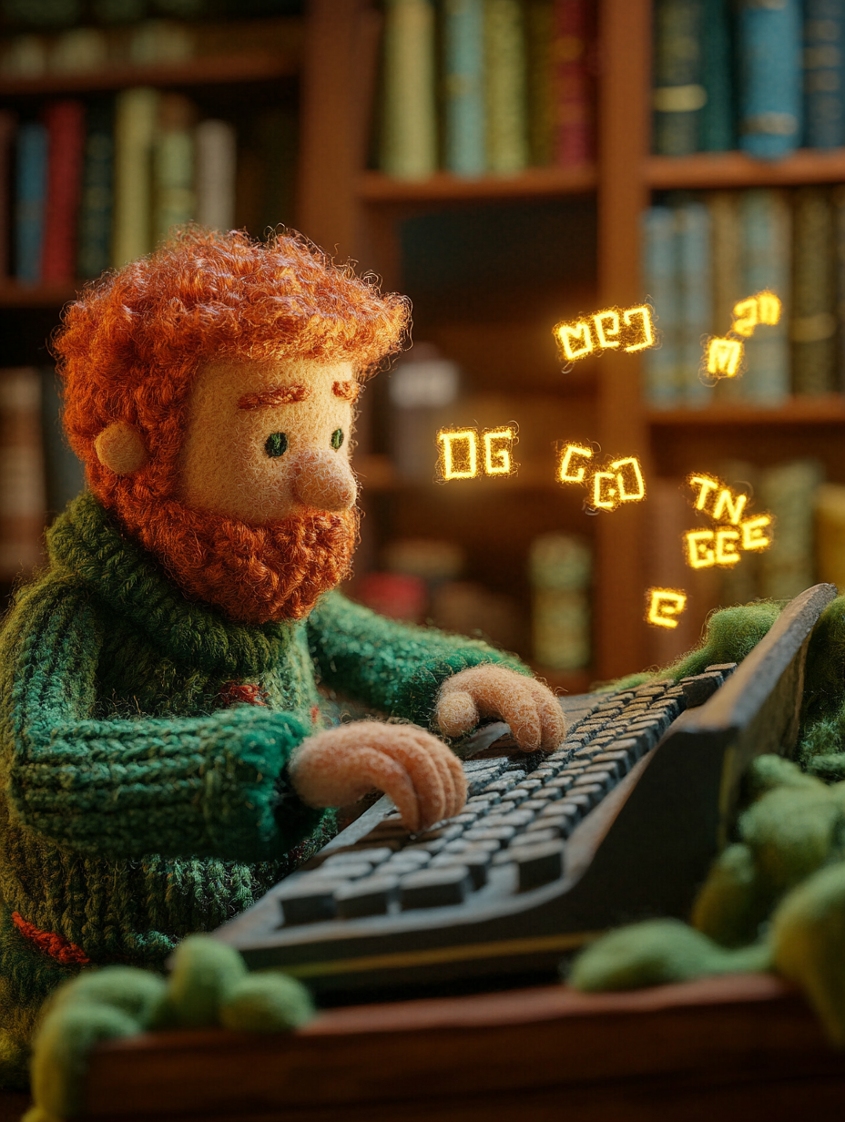
- Sound cues are used all over the place. Anyone who's ever worked in a kitchen hears the godforsaken ubereats alert sound in their nightmares.
- About ten minutes ago, I got startled by my phone deciding that the "you should stand up" vibration pattern should be three long BZZZZ-es... amplified by it sitting on my hollow-sounding printer.
- If another fucking god damn website asks me to chat with an AI agent in it's stupid little floating chat bubble, only appearing AFTER I interact with the page so it's allowed to also make an annoying "chirp!" sound, I WILL become a chicken farmer in some remote forest eating only twigs, berries, and improperly-raised chicken eggs.
All of these things annoy me, and actively make me hate computers. A silent glass brick can go in my pocket because I know it's not going to bother me or beg me to talk outloud to it. If it was some sensory-overload distraction machine (which, by default, it is) it would find itself over the side of a bridge rather quickly. It's getting in the way of my human experience! The one where I'm the human, not the computer!!